UNLOCK PLANT POWER WITH THE SMART BRIIV AIR FILTER

The Briiv Air Filter is all about creating healthy and happy environments in a home. It works to remove pollutants from your home. Good air quality means better sleep, higher energy levels and improved cognitive function. I could do with more of all 3 in my life please! Better sleep equals higher energy levels for juggling family life and enriched brain power to remember our son’s ever changing schedule at school, birthdays, blog post deadlines, wedding anniversaries etc etc! It’s a very attractive proposition.

*Sponsored

What causes air pollutants?

Pollutants don’t just come from traffic and factories. Tiny particles and harmful gases are released into our homes every time we cook a meal, or light scented candles to remove the smell of what we’ve just rustled up after a hard day at the office. Our family favourite at the moment is cooking salmon and vegetables; simple and quick, delicious but incredibly smelly! We use cleaning products to clean up after our beloved little ones meals that end up on the rug in the back room and pollutants are present even when we play with our pets; Louis our 13 year old cat is a bona fide lap cat and we love him for it. Briiv helps to remove these pollutants so we can enjoy life to its fullest.

Commitment to circular design

Briiv’s concept to design is what has really grabbed my imagination. They have a commitment to what is known as a ‘circular design process’. It’s an actual thing. Google it and read up on circular design products. It’s a refreshing approach to designing and producing products which Briiv also explain in a blog post here https://www.briiv.co.uk/blogs/news/embracing-the-circular-economy-the-briiv-story-so-far?_pos=1&_sid=920c4cd0e&_ss=r  . Simply put, circular design is where products are designed with the end of the product's life in mind.

Super low maintenance

With one simple setup, Briiv is zero maintenance – no watering required - making it the most sustainable filter on the planet. When you’re done with the filter it can be thrown in the garden or compost to become part of the earth again – how cool is that?! A sustainable air filter that is good for the environment from design to manufacture.


Briiv utilises a combination of natural, non plastic filters which have been proven to mop up all manner of airborne pollutants. The green material is an ethically harvested inorganic material called Reindeer Moss, renowned for its innate ability to trap particulate matter in its structure. This layer will comfortably capture pollen and other allergens.


The middle layer is taken from waste coconut product and repurposed into a fantastic coir filtration fibre. This dense mesh targets even smaller particles like bacteria and mould.


Working in the core of the machine is the bespoke Silk Matrixfilter. Combining Activated Carbon bonded with a fine silk based protein web, this can trap the smallest of particles like harmful fine dust and large viruses as well as mop up unpleasant smells and other VOC’s. The raw silk is Ahimsa or ‘Peace Silk’ sourced from sustainably and humanely harvested moth cocoons.


Best looking filter around - bar none


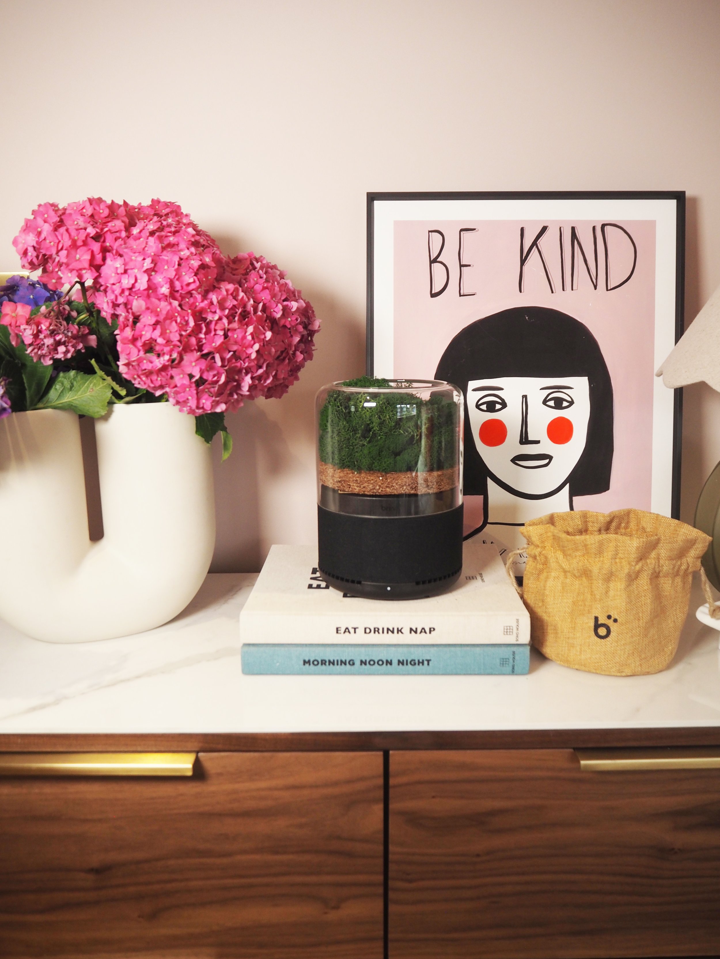
Designed to improve your environment, Briiv is functional and looks great anywhere, bringing natural style to your home or office. Briiv blends beautifully into your interior and sits perfectly alongside plants or displayed as a centrepiece. Somehow Briiv have managed to package together a filter that looks aesthetically cool and pleasing on the eye. The best way I can describe it is if you have watched karate kid (that’s the 80’s kid in me) Mr Miagi prunes a beautifully cultivated bonsai tree with nail scissors. It’s like if a bonsai tree was planted in Scandinavia and then ikea bottled it up in a shiny glass dome. It’s sophisticated, calming, peaceful, efficient and is as powerful as 3,043 medium size houseplants. That’s right 1 Briiv is the equivalent of 3,043 medium size houseplants - but without watering and maintaining them (if your house can hold that many houseplants that is).  It’s at home as the centrepiece on my dining table when I’ve got the Friday afternoon school mum crew round for end of school week drinks, to when I am having a get fit moment on the Pelaton and I’m cycling like mad to Queen’s don’t stop me now and the air filter is keeping the air in the back room fresh by filtering out all the sweaty and smelly bi products of my workout.

Briiv efficiency

Briiv will effectively improve the air quality in a 36m² (387ft²) living space in just one hour. So you don’t need it on constantly if you don’t want to! Ultimately this amazing little filter has been a game changer in our house, the hubby suffers from hayfever (it seems like all year round he’s mentioning hayfever!) and the little one brings back all kinds of germs from school. Having a filter that purifies the air and does it naturally and sustainably can only be a win win.

How TikTok trends are influencing home décor trends

Source: Pexels

TikTok has become one of the fastest-growing social media platforms in recent years. In 2020, it grew a massive 325% in one year. It currently has more than a billion users around the globe and so has become a significant player in the influencer market. TikTok is no longer about funny dances and lip-syncs; it is a place where people go to impact consumer behaviour, including interior design trends. As well as being a pathologically proven addictive app that everyone is using, TikTok has encouraged some exuberant and brave choices homes across the nation.
Trending hashtags

The easiest way to assess trends on TikTok is to look at the best-performing interior and home décor hashtags over the last twelve months. The totals are gathered based on the number of videos and total views.
According to a report by Display Sense, #vintage, a trend which began in May 2021, has already accrued a massive 16.6 trillion views across 1.1 million videos – it is also worth noting that #renovation came in at number 4 and has already gathered 5.5 trillion views. The décor trend towards revamping the old has been popular in the wider interior design circles, and in some ways, this is reflected on TikTok.

More powerful is the popularity of #cottagecore and #driedflowers, which shows one of two things. First, that rural chic is making its presence felt in the trend-setting homes of the urban class. This chart shows other trends that are extremely popular on the platform. This chart shows other trends that are extremely popular on the platform.

Influence on Google Searches

It is interesting to take these trends on TikTok and see how they match with Google keyword searches. People turn to Google because they feel they have something to learn. They may have heard of something that interests them and would like to emulate this in their life. As predicted, the trends in home décor pretty much always began with an increase in searching on Google.

Three search terms saw a significant increase in search volumes. The Sunset Lamp started trending on TikTok in April 2021. The lamp projects a sunset-like light into a room, creating a relaxing effect. Of course, these lamps prove popular on TikTok as they provide a beautiful backdrop for filming and are relatively cheap to recreate. #Cottagecore also became popular in April 2021 and encouraged interiors based on the

farmhouse. While this is a décor trend, the popularity of these videos on TikTok had a lot more to do with the change in lifestyle it represents. Natural materials and a need for lots of sunlight in rooms are predominant. With the lockdown and worries about the environment, it is unsurprising that we are looking for comfort in our homes. The third trend closely correlated to a Google search is the hashtag Japandi. Think Japan and

mix this with a little Scandi minimalism, and you come out with Japandi. The Japanese concept of wabi-sabi is at the core of this trend, as people appreciate the contentment to be found in leading a simple life. This need for minimalism and few material possessions matches the functional design concepts of Scandi interiors. Again, this décor trend is likely a response to environmental and climate worries. It is a sign that younger generations may be taking a more ethical approach to interiors.

Into the future

If a mix of Google searches and emerging TikTok hashtags are a great barometer for future fashions, it is worth looking at the data to help see the future. Here we take those terms that are still growing on Google and have emerging popularity on TikTok. The following are the trends that are continuing to grow in popularity thanks to going viral on Tiktok.

Source: Display Sense

It seems that we are becoming most concerned with the look of our bathrooms while minimalism continues to grow. Most interesting is the emergence of Goblincore and Fairycore as design concepts. Goblincore appreciates parts of nature that are not typically considered beautiful, including mushrooms and skulls and other such regalia. Fairycore instead focuses on the aesthetic around fairy and elf mythology and includes soft pastels, butterflies, flowers, and allusions to magic. It seems the future needs to be more fantastical than the present, and maybe we have a yearning for more innocent times in our design.

A valuable tool for designers

What is clear from this is the power of TikTok for designers. Suppose the interior designer can match Google searches to hashtags on the most popular social media platform. In that case, they can begin to anticipate the tastes and desires of the market and boost their success.

CHOOSING A SOFA WITH ROCKETT ST GEORGE

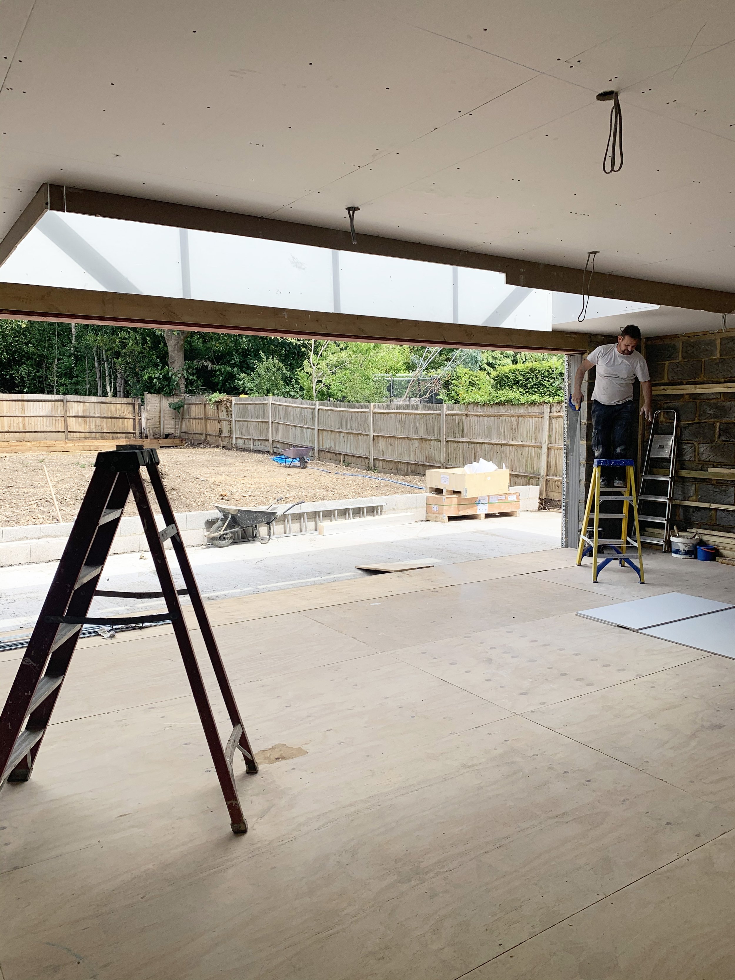
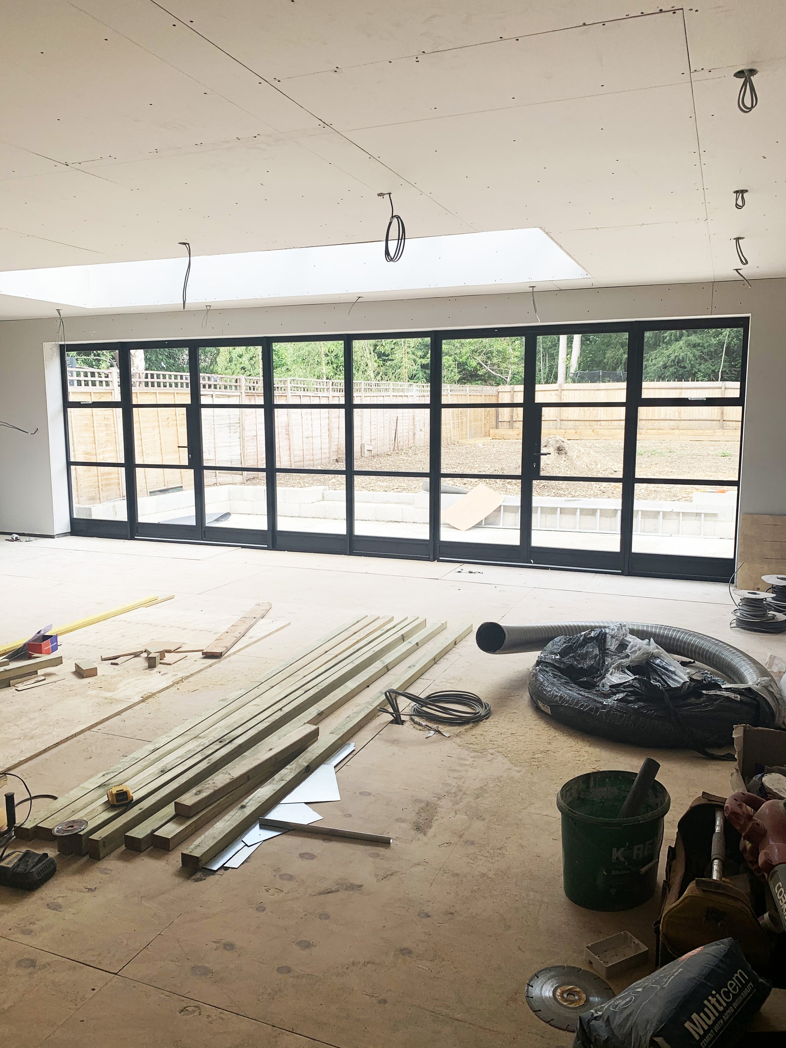
When we were planning our ground floor extension, we knew we wanted the space to be open plan, but we wanted to zone the space into three clear areas; a kitchen, a dining area and lounge/ family space for us to watch tv together with plenty of room to lounge and relax.

The space is 7m deep x 10m wide which gives us 70m2 to play with.

Above is the open plan space which we had to play with, before the kitchen was installed. These are before shots before the glass doors went in, and before the walls were fully plaster boarded.

Our open plan space, before the kitchen was installed.

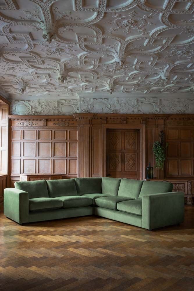
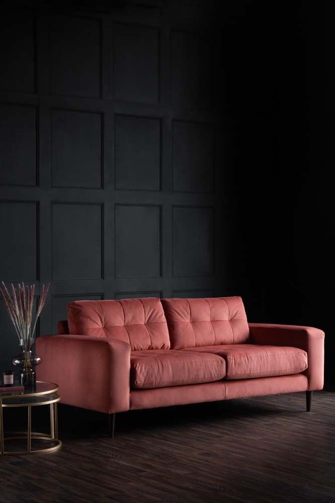
I’d heard great things about Rockett St George’s sofa offer. Mainly that they were extremely comfortable, stylish and came in over 16 different shades of velvet, 6 different shades of boucle fabric and 8 different shades of woven fabric. They offer a huge selection of ‘Made to Order’ Sofas and armchairs, which can be delivered in 20 weeks, and also some sofas and armchairs in stock for 8 week delivery. It’s worth checking the RSG website for details as stock might change.

My Favourite Rockett St George ‘Made To Order’ Sofa & Armchair Offer

You can also order fabric samples from the Rockett St George website, so you don’t need to visit the Liberty London concession for this. I later ordered a swatch of the ‘Rose Pink Velvet’ , so I could compare it to my other soft furnishings and the green shade of my kitchen.


Having such a large open plan space, I had my heart set on a corner sofa to fill the space, as I loved the idea of us all being able to use it as a family and thought a smaller sofa would look like its rattling around in the open space. I had seen Rockett St Georges corner sofa and loved its classic shape which has hints of 70’s nostalgia.  It’s a gorgeous large corner sofa which is perfect for large living spaces, with its chic corner design, it can fit the whole family of 5 onto it for that much needed family time.  

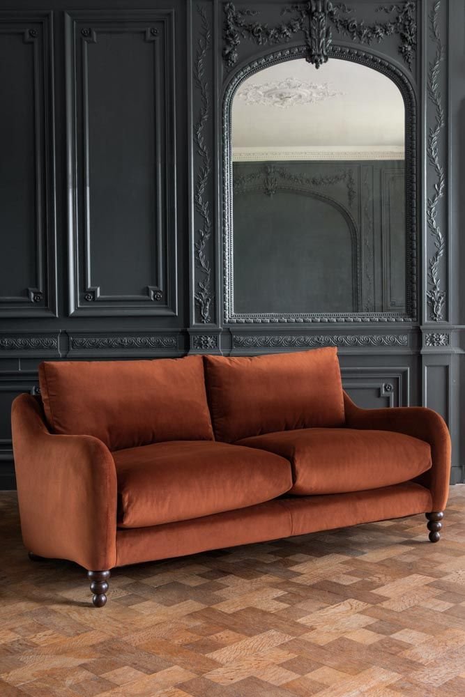
With RSG being predominately an online business, I had seen that had a concession in Liberty London, so I set off to see their sofas in person to try them out and to check their squish factor during last summer. The sofa I chose wasn’t there to be seen in person, but I got to try out one of their 3-seater sofas and see their vast range of fabric offer. Here I am below sitting on the Suave Large 3-Seater Sofa In Umber Rust Velvet in the Liberty London store. I found this sofa incredibly comfortable so had faith that the Gorgeous Corner Sofa would be just as comfortable.

Me sitting on a Rockett St George Suave Velvet Large 3-Seater Sofa in Liberty London in the Umber Rust Velvet.

 Choosing the Right Fabric

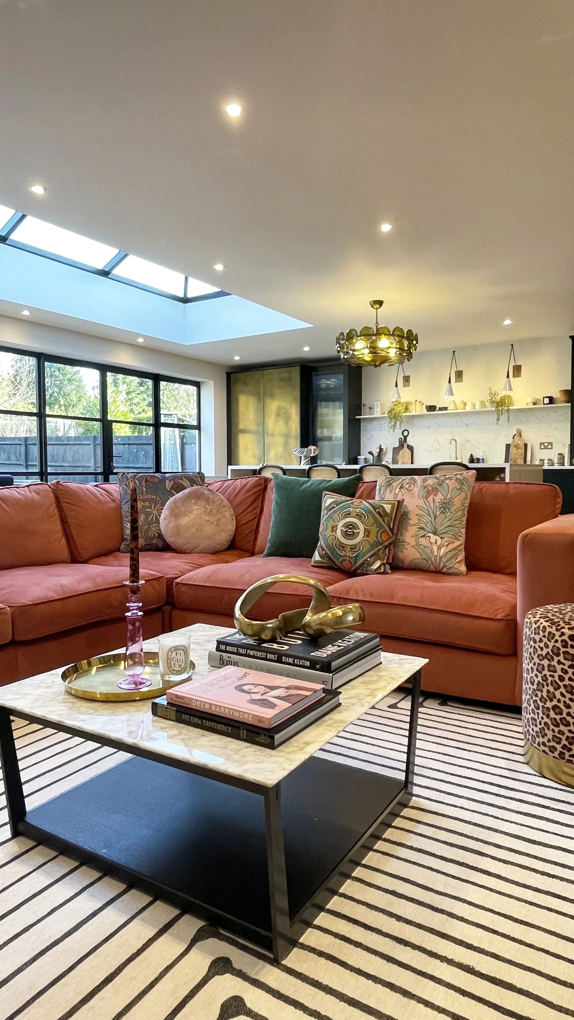
The colour which took my fancy was the ‘Rose Pink’ Velvet.  I’d always wanted a velvet pink sofa and loved the idea of making a statement with one in this space. Plus, with our kitchen being in green, I loved the idea of the pink and green contrasting, but still sitting harmonious together. It’s a sort of terracotta pink, in fact it’s a very similar shade to our lounge which is just screened from this space by glass doors, so it’s nice that these shades are interlinked throughout my home as it ties it all together.  

I settled on the ‘Gorgeous Corner Sofa’ in Rose pink and made the order of our new Corner Sofa.

 Delivery took 20 weeks as the Corner sofa was made to order and it arrived just before Christmas, which was ideal as we wanted it for our first big family Christmas in our new home (As Covid scuppered our plans the year before).


I can now confirm that this Gorgeous Corner Sofa is just as squidgy, stylish and comfortable as I had hoped and my three year old particularly loves to lounge on it whilst watching cartoons, whilst I cook dinner behind.


The ‘Gorgeous Corner Sofa from Rockett St George in Rose Pink Velvet.

The ‘Rose Pink’ shade of velvet is super pretty, but still warm and cosy, it’s the perfect colour pop to zone the space perfectly and it’s created the ideal space for us all to hunker down in the evenings to watch a film. To say I’m extremely pleased with it is an understatement. It fits perfectly into our open plan space, and the colour is a gorgeous contrast to the green kitchen and it is extremely comfortable. I really enjoyed my visit to the Liberty London store to see the Rockett St George concession and would highly recommend RSG for finding your dream sofa!

And if you want to see more of this room, come check out my Instagram page @Houselust.


The Gorgeous Corner Sofa’ from Rockett St George in Rose Pink Velvet.

The ‘Gorgeous Corner Sofa from Rockett St George in Rose Pink Velvet.

The ‘Gorgeous Corner Sofa from Rockett St George in Rose Pink Velvet.

Disclaimer: This blog post was all written, styled and photographed (apart from the Rockett St George stock sofa photos) by Amanda Cotton *This is a gifted collaboration with Rockett St George and all views are my own. I will only work with brands that I know will fit with my style and that I trust and love. The links contain Affiliate links.


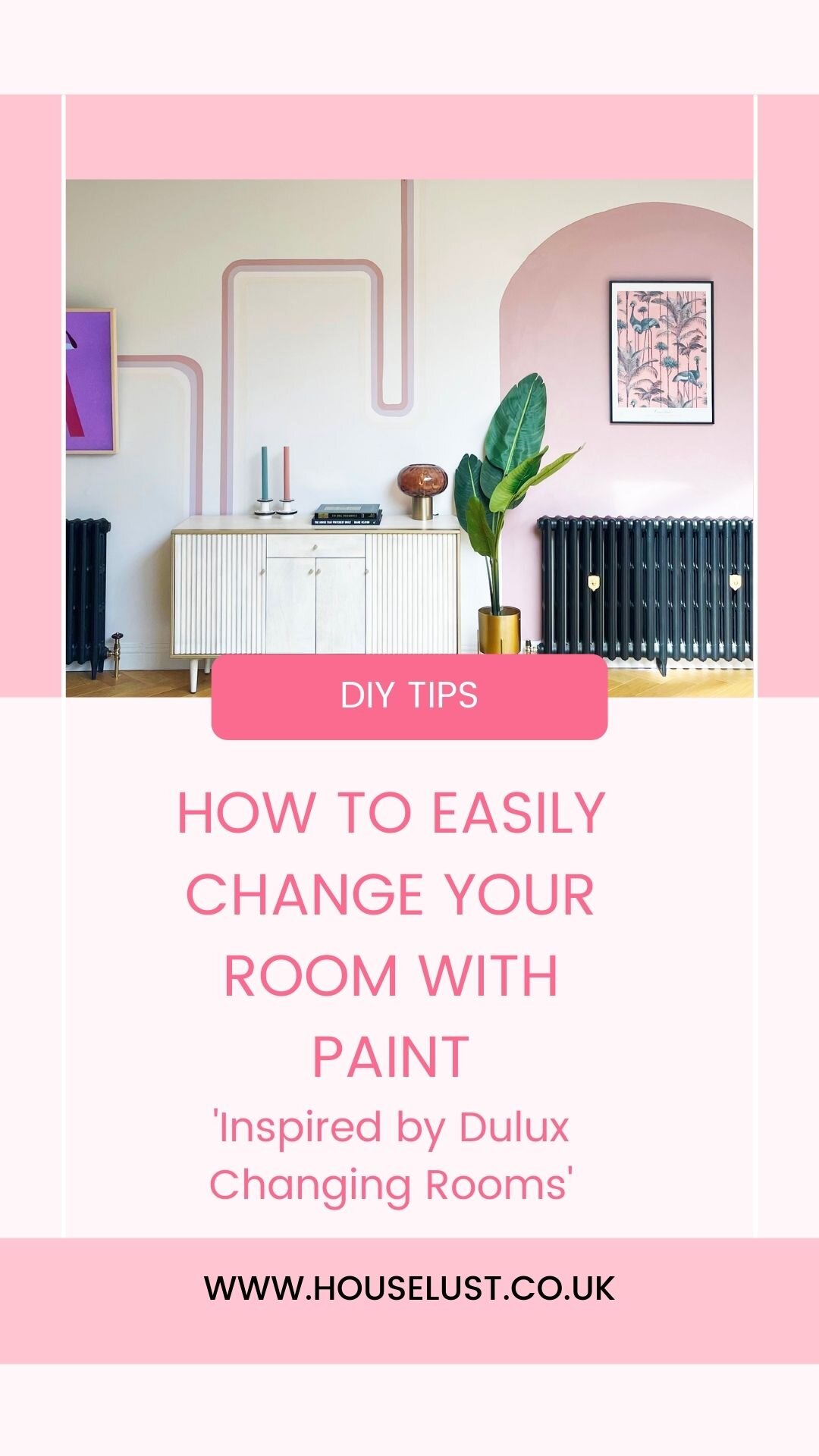
HOW TO CREATE A PAINTED WALL MURAL, INSPIRED BY DULUX CHANGING ROOMS - AD

AD - This post is a paid partnership with Dulux, inspired by Dulux Changing rooms.

After an 18 year hiatus, my favourite 90’s TV show for all interior design lovers is back; Changing Rooms!

Changing Rooms re-launched in August 2021 and aired on Channel 4 in the UK, on Wednesdays at 8pm, and is being powered by non other than leading paint brand Dulux.

So what is Changing Rooms? Well, in a nutshell it’s a fun interior design TV show where we see two sets of homeowners from the same neighbourhood work against the clock to renovate a room in each other’s houses. They won’t be alone though, they’ll have the help of interior designers Jordan Cluroe and Russell Whitehead of 2LG Studio and Laurence Llewelyn-Bowen, whilst also having a skilled carpenter and joiner on hand; Tibby Singh.

It’s packed full of design and DIY hints and tips, teaching us all how to be crafty on a budget by upscaling and adding sparkle to unloved or outdated corners of our homes. It’s inspiring to watch how a room can be easily transformed with just a lick of paint.

I’ve been hugely inspired by watching Changing Rooms, and fancied updating a tired and boring wall within my home, by using some of the tips I’ve learnt whilst watching the show.

Today, in this blog post I’m going to show you how I took a drab empty white wall in my home, and added some fun and colour, which adds print and texture, whilst only using Dulux ‘Simply Refresh One coat’ paint’.

I decided I wanted to add a painted mural to my dining room wall. I’ve seen murals making a reappearance since 70’s trends returned this last year, and I love the idea of how just using masking tape, a spirit level and some house hold items for templates, you can create your own 70’s wall. So thats exactly what I did.

This is the wall in question. The opposite side of this wall is our kitchen which is a lot more interesting, I just seemed to have neglected this side after our renovation.

BEFORE

THE INSPIRATION

I love the simplicity of these ideas, using masking tape and a spirit level. They make such an impact without having to add tones of layers of paint.

Image credit Very Gay Paint .

Image credit Very Gay Paint .

Image credit : Forget Me Via Pinterest.

Image credit : Forget Me Via Pinterest.

THE PROCESS

The first thing I did was mark out a rough plan of where I wanted to add the lines and curves. You can do this on a bit of paper, I used Adode illustrator just so I could visualise the curves and lines with the correct proportions.

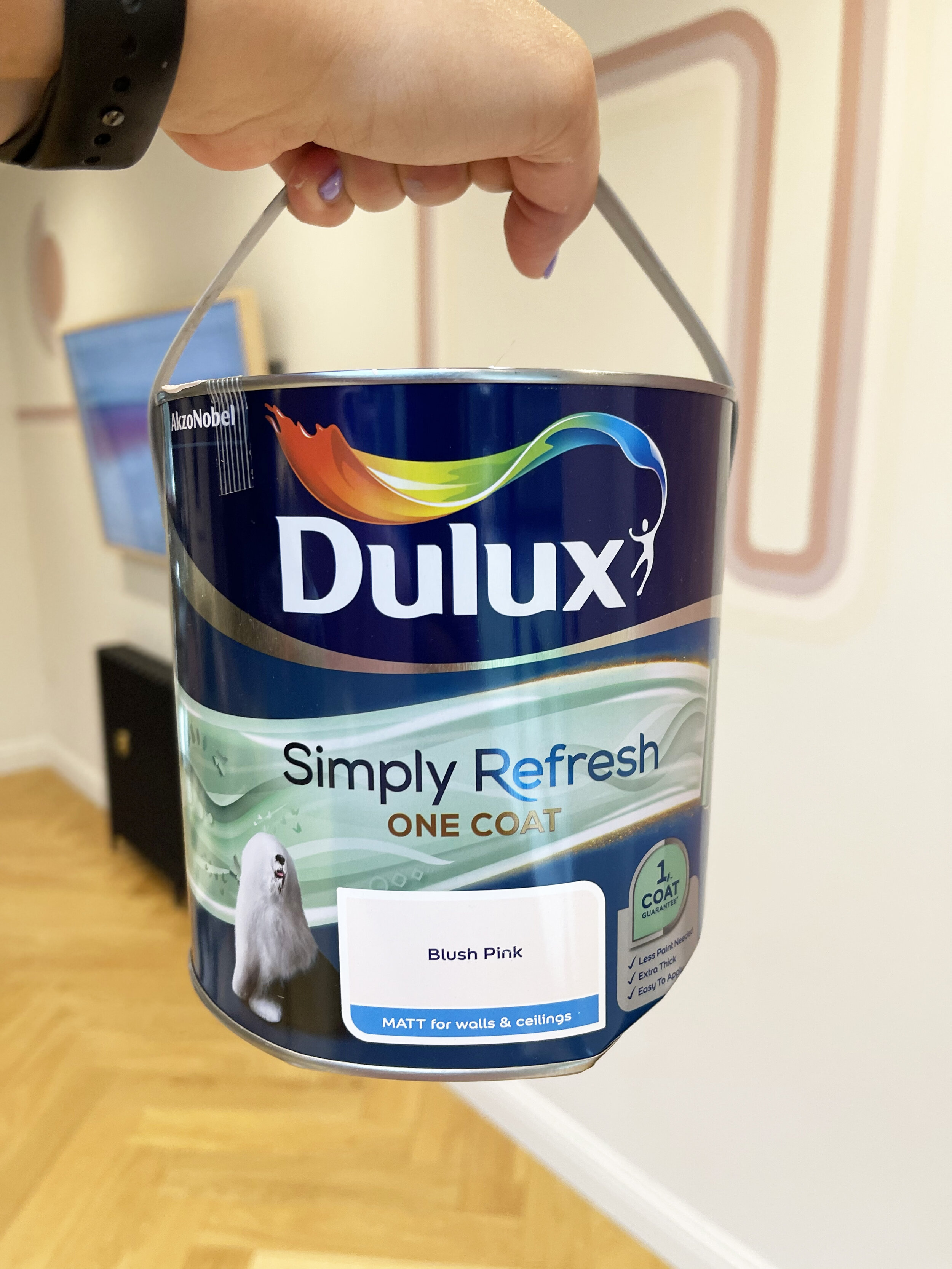
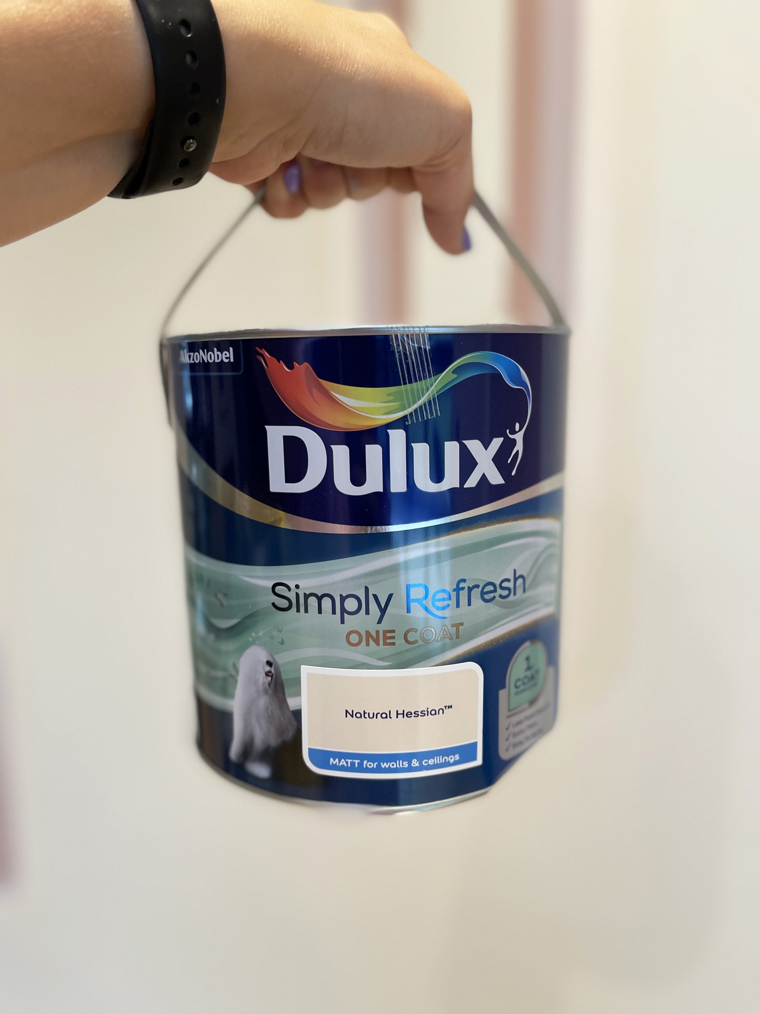
I then decided on the paint and colours. I wanted my wall mural to be quite harmonious, so I chose colours from Dulux Simply Refresh One Coat Pinks, Violets and yellow range, with an added neutral, as I knew the coverage would be perfect, and I’d only have to do one coat to save me time.

How I designed my wall mural.

How I designed my wall mural.

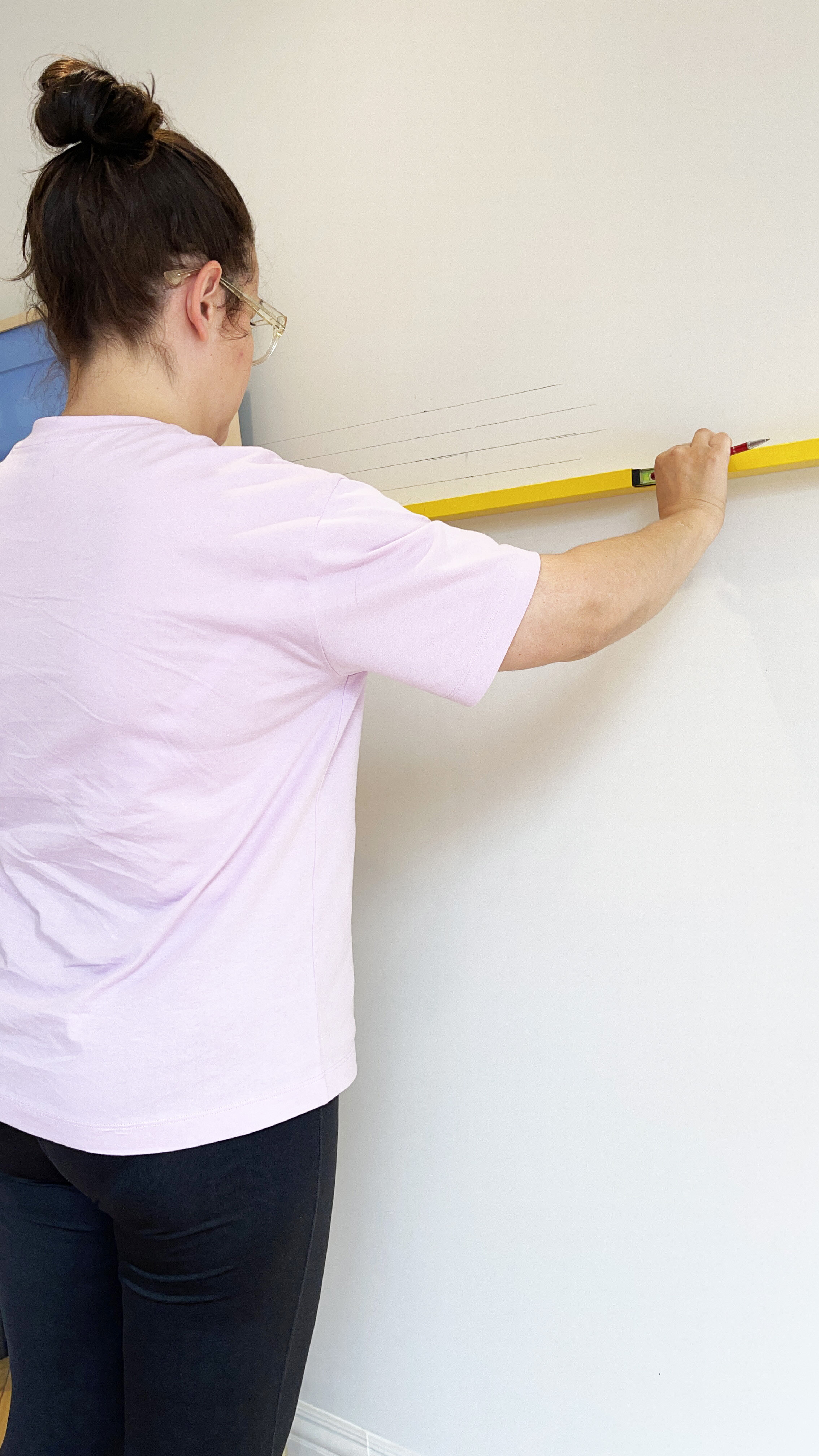
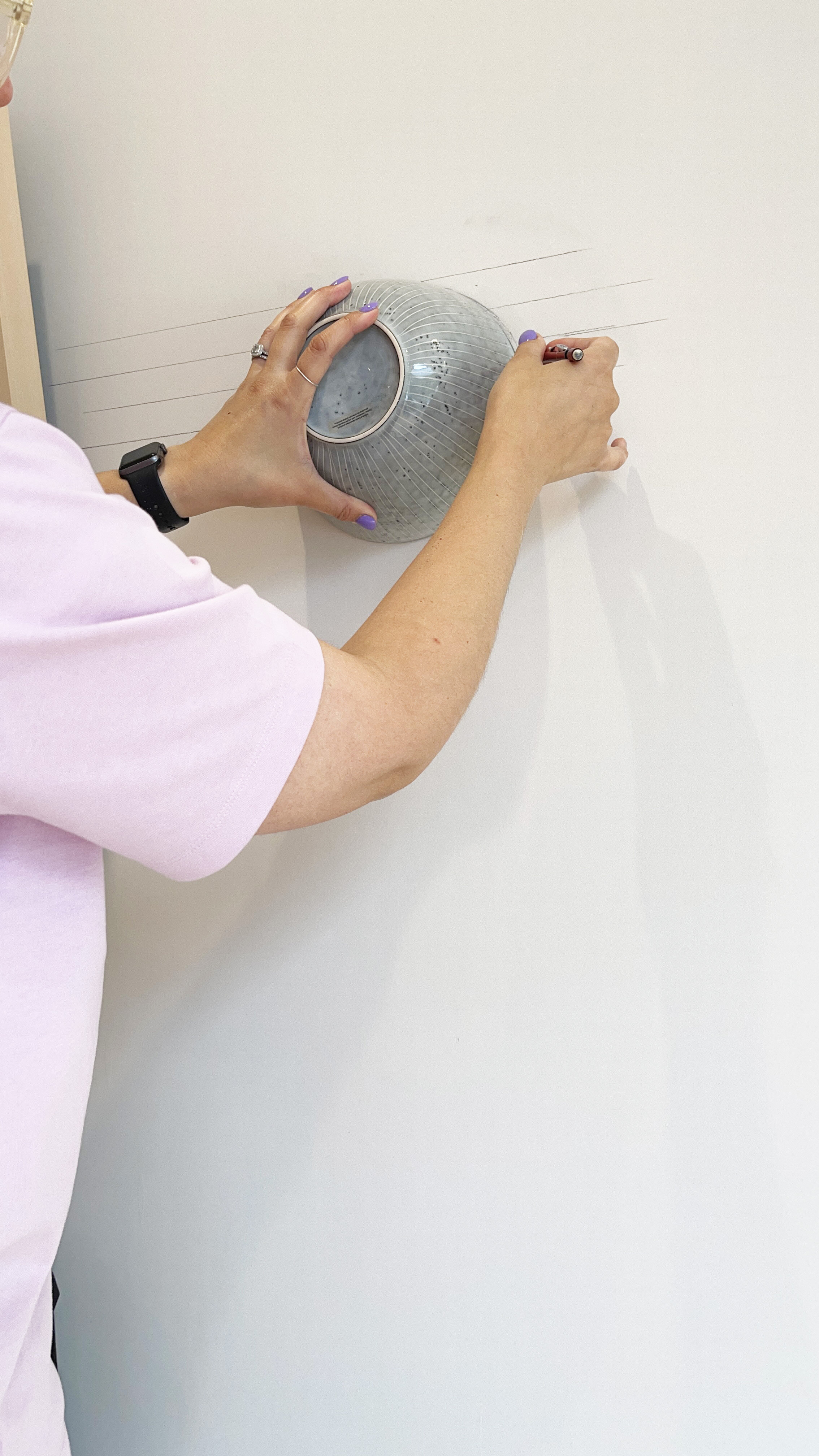
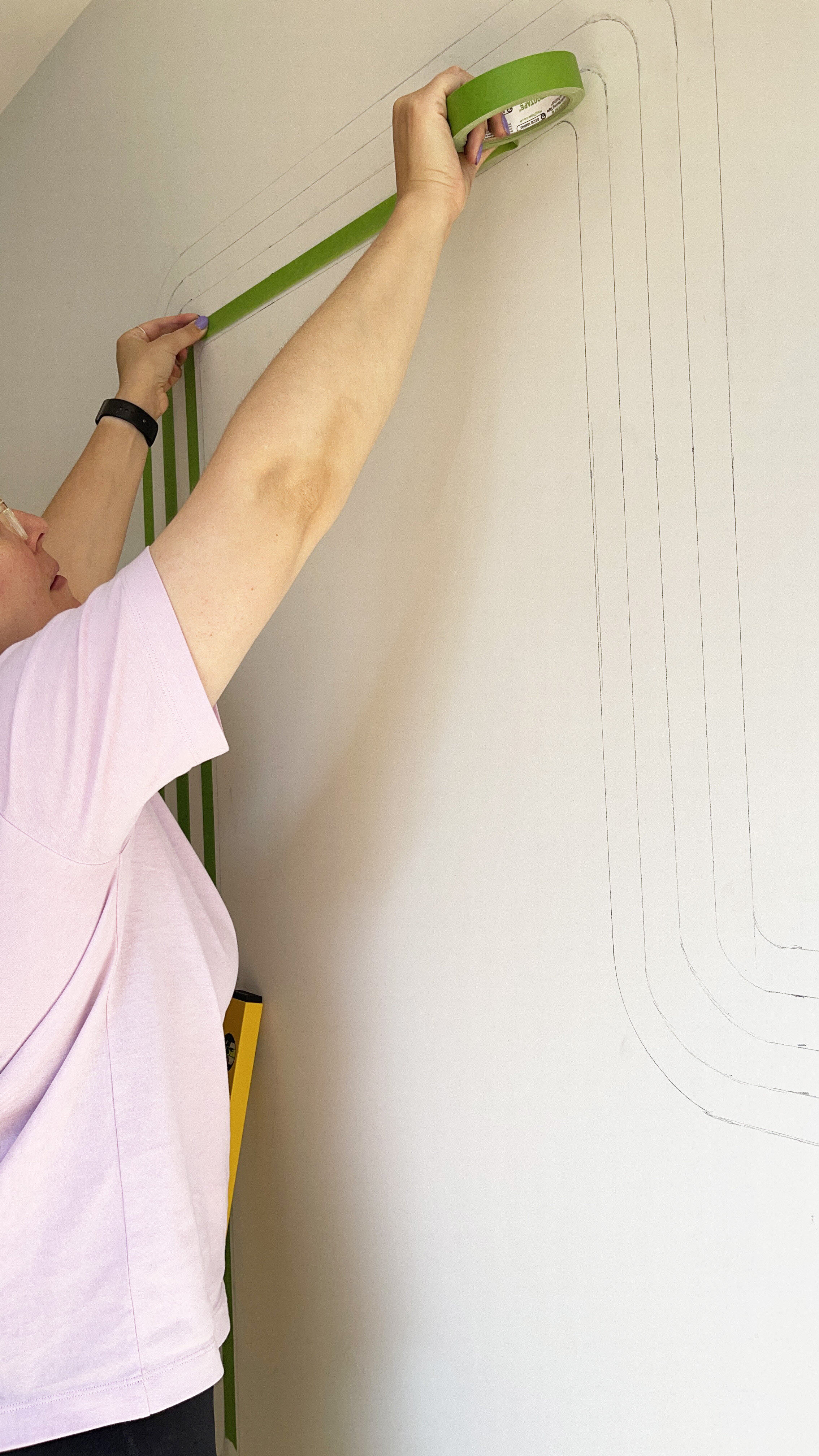
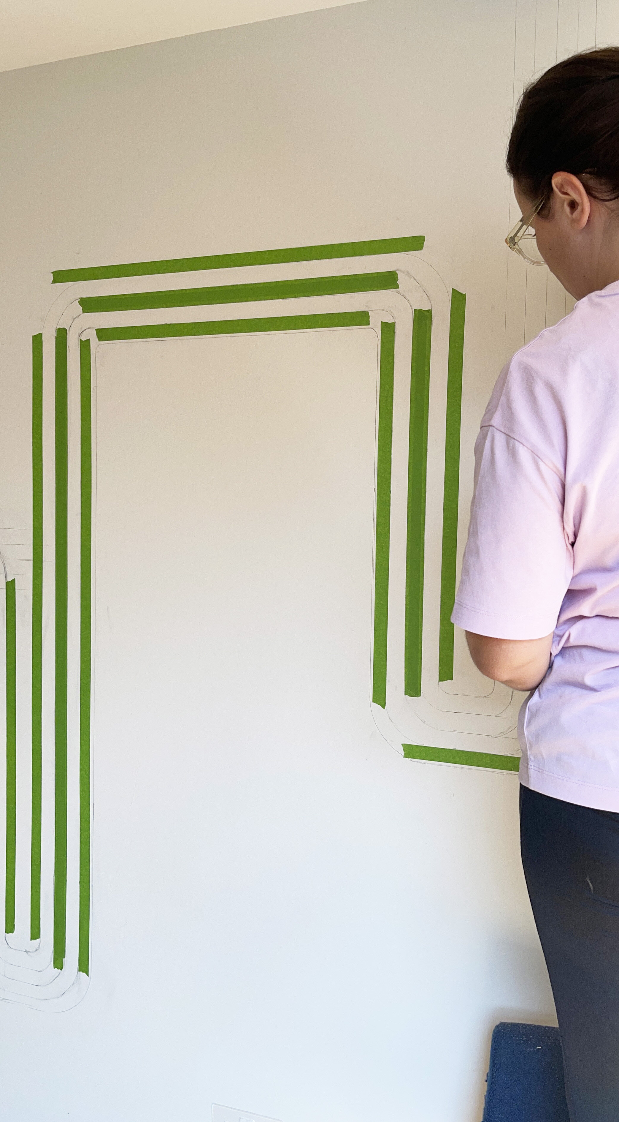
I then got to work on drawing all the lines in pencil on the wall. I used a spirit level to make sure the lines were straight , and I used a kitchen bowl to do the curves.

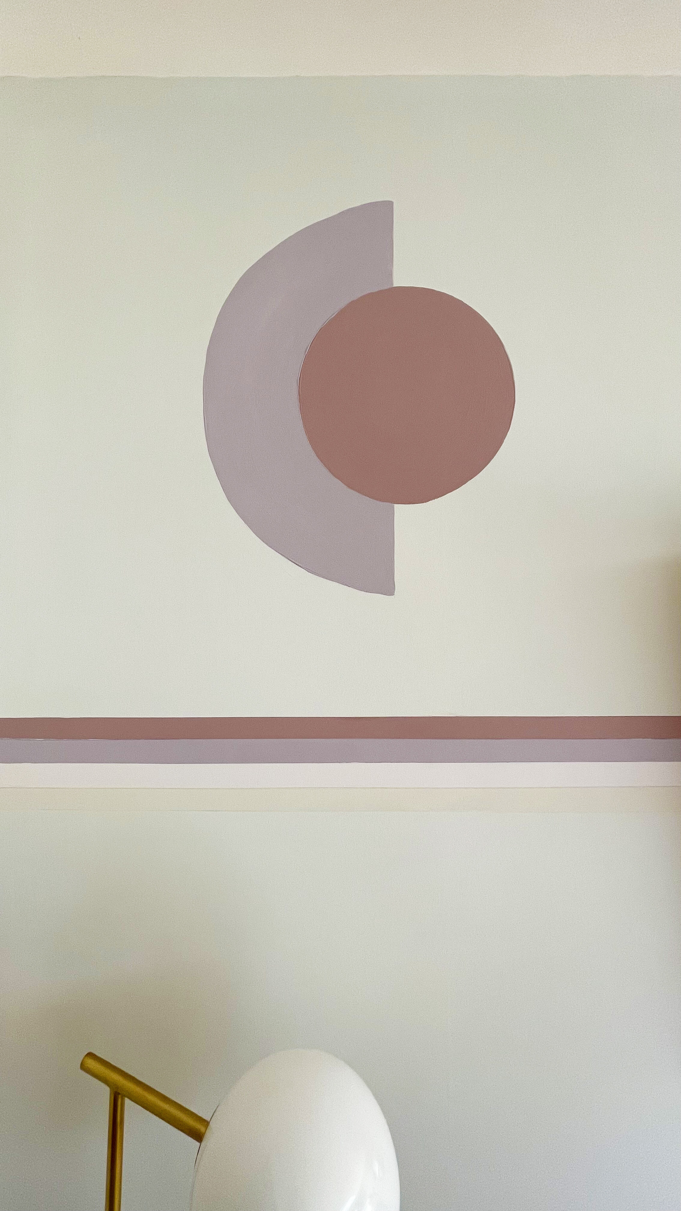
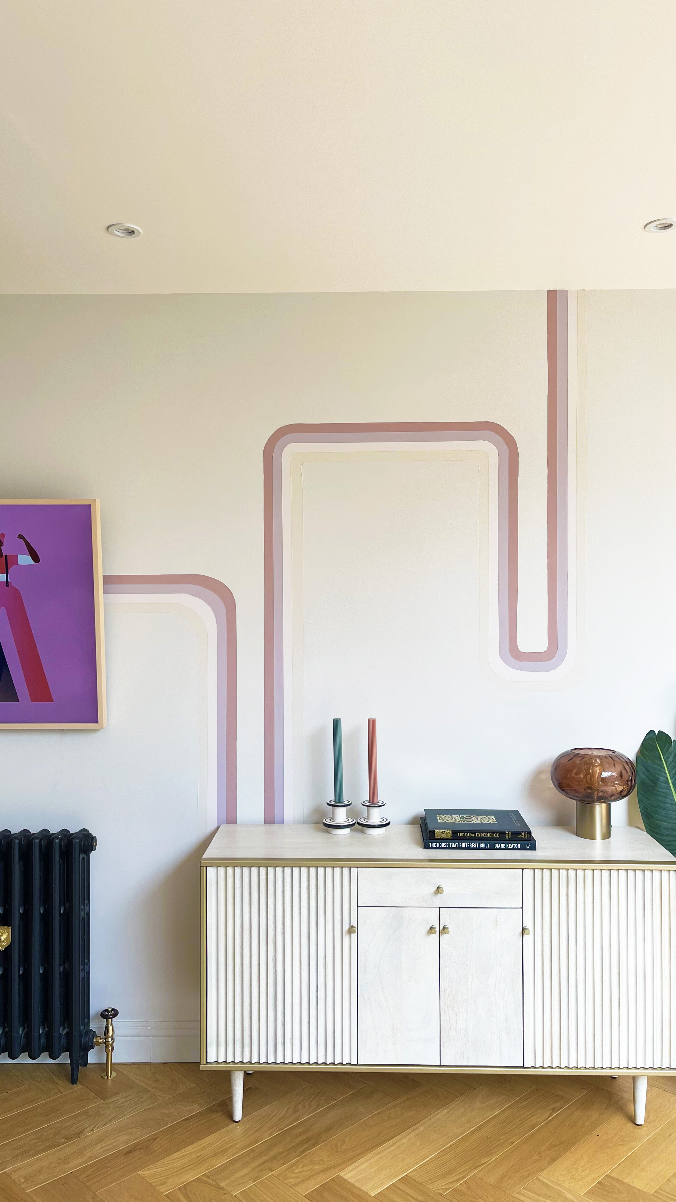
I measured each painted line to be 3cm wide each.

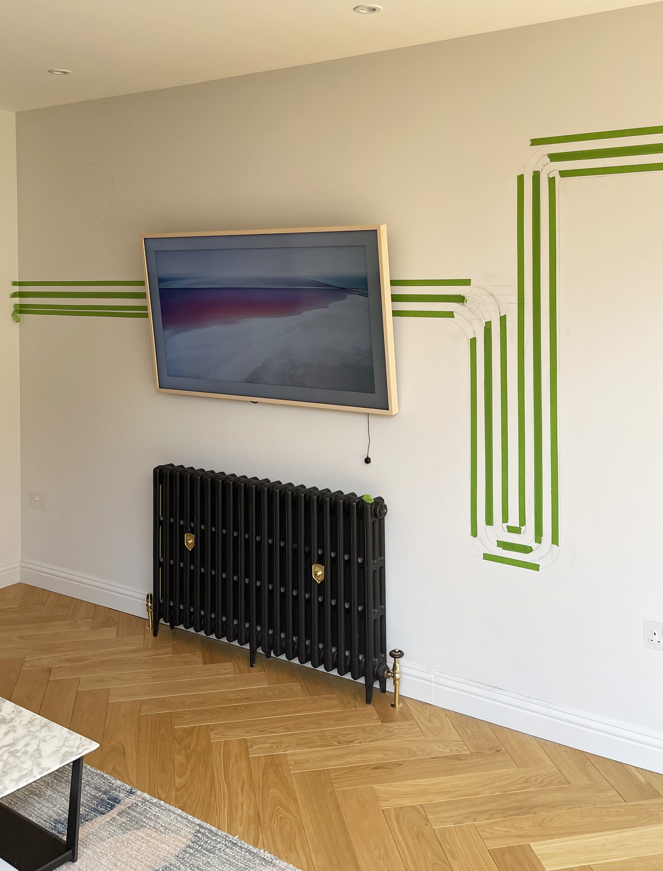
I then started to mask the areas using a general masking tape which is suitable for decorating, to give me the ultimate straight lines for decorating.

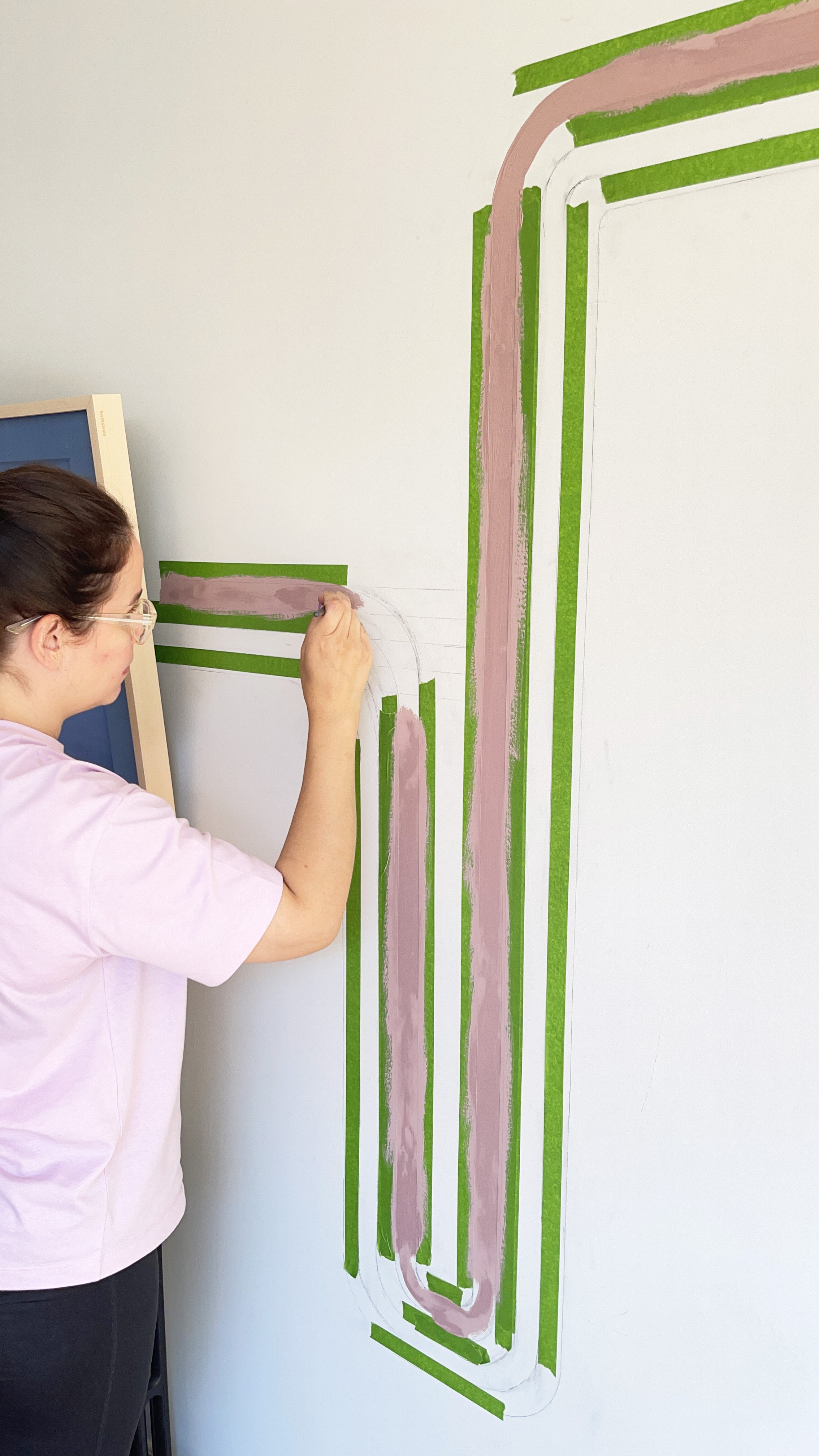
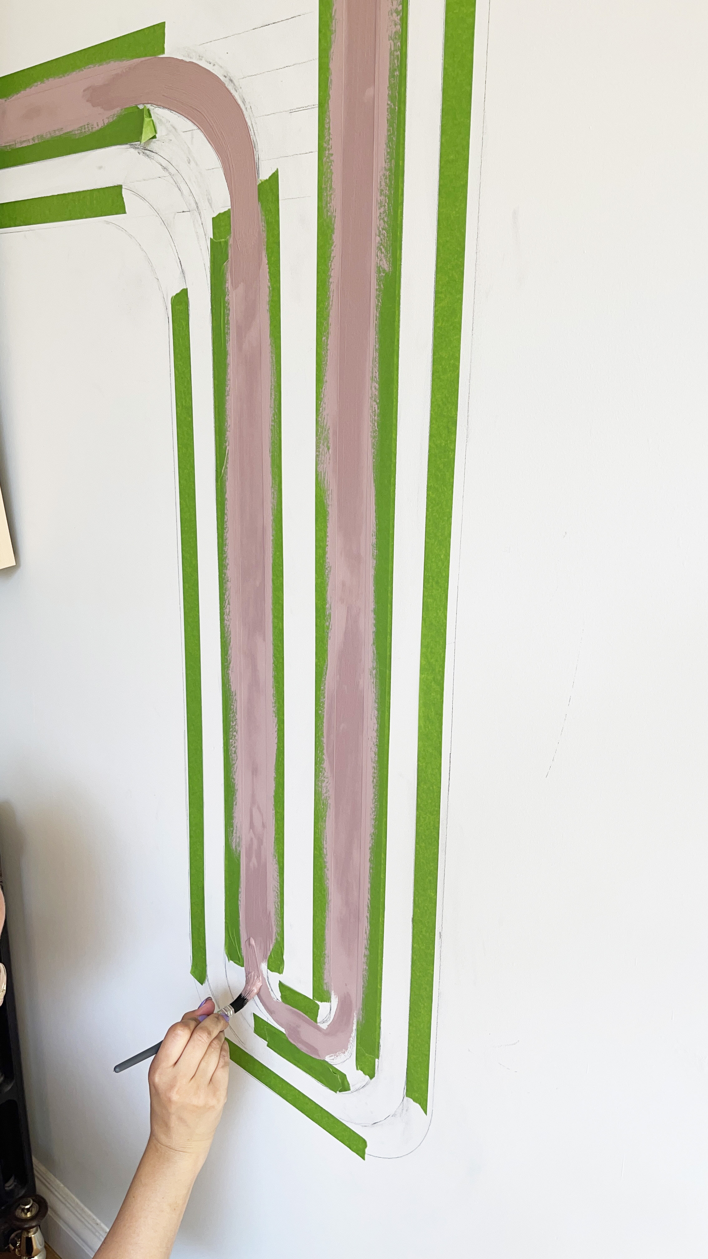
I then got to work on the painting , choosing to paint the curves by free hand as I has already marked out the lines in pencil.

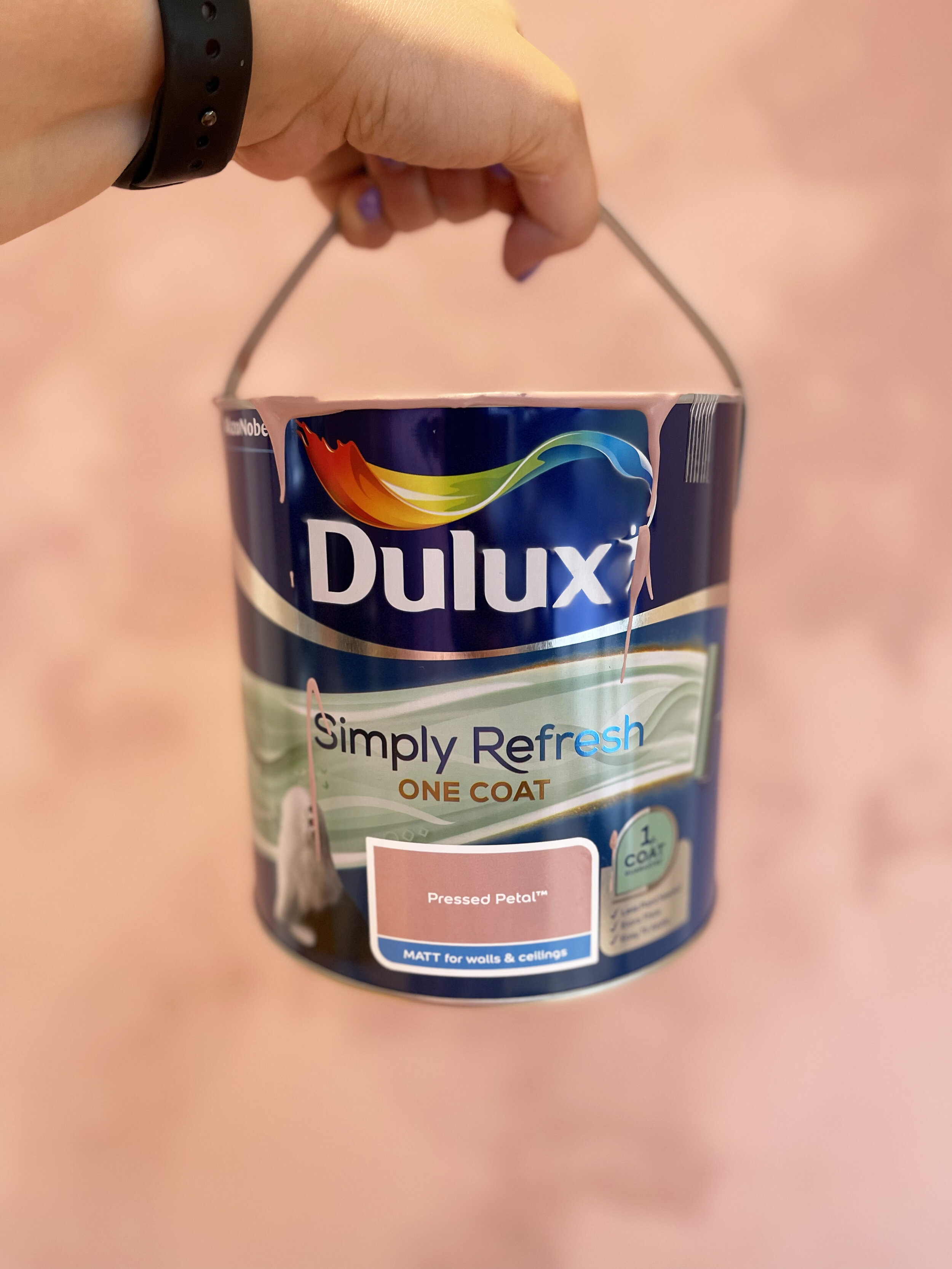
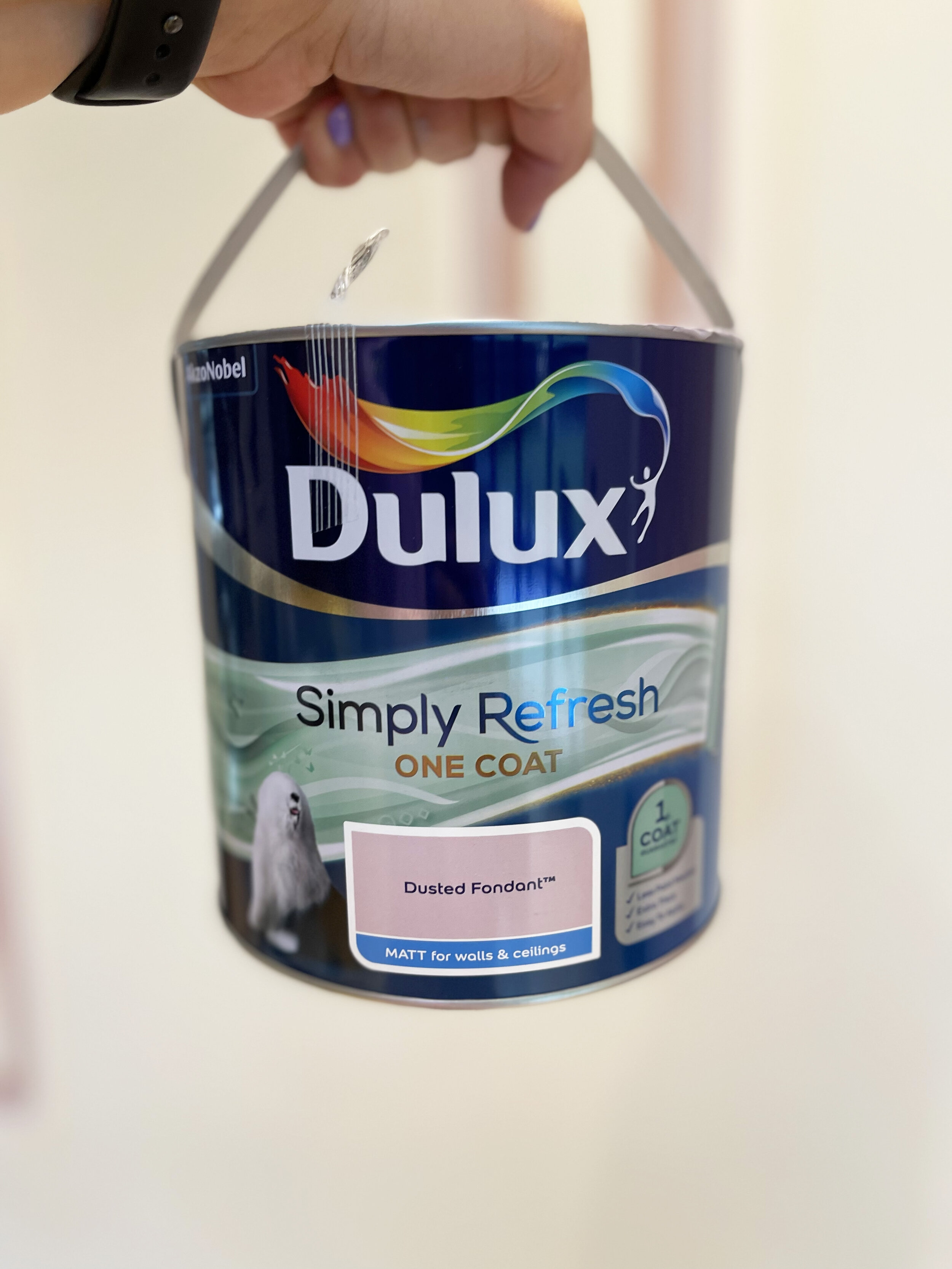
I started with the darkest paint colour on the outside line which was Dulux Simply Refresh One Coat in Pressed Petal, then did the third line which Dulux Simply Refresh One Coat in Blush. Once these had dried, I peeled away the masking tape and re masked up the other two lines which were Dusted Fondant as the second line and Natural Hessian as the fourth. All From Dulux Simply Refresh one Coat range.

After painting the first and third line, I waited for the paint to dry, before peeling back the masking tape, to then re apply new tape for the second and fourth colour blocked line.

After painting the first and third line, I waited for the paint to dry, before peeling back the masking tape, to then re apply new tape for the second and fourth colour blocked line.

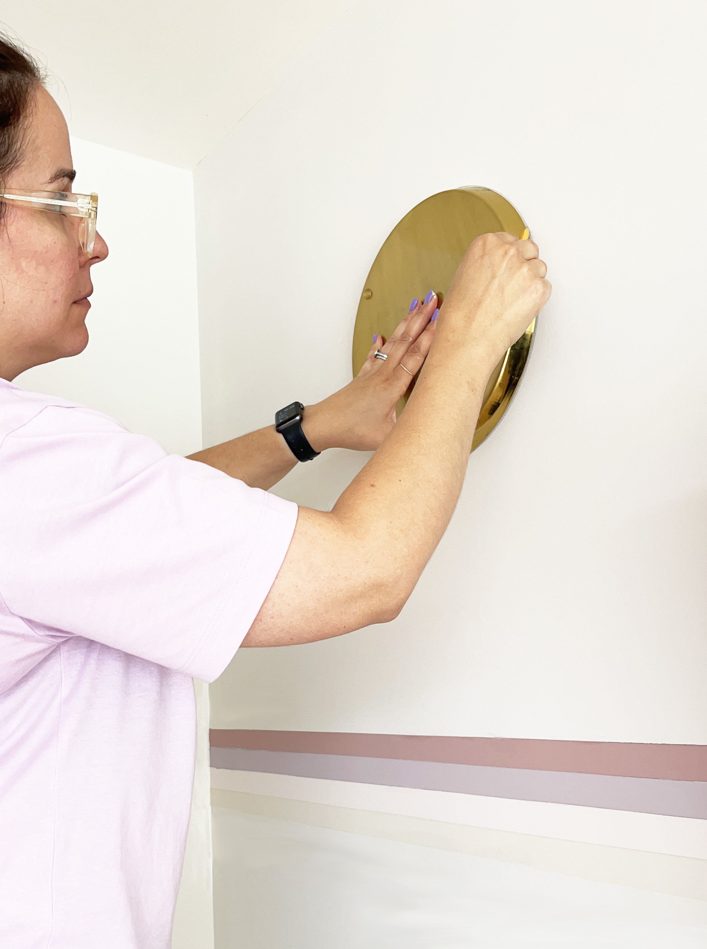
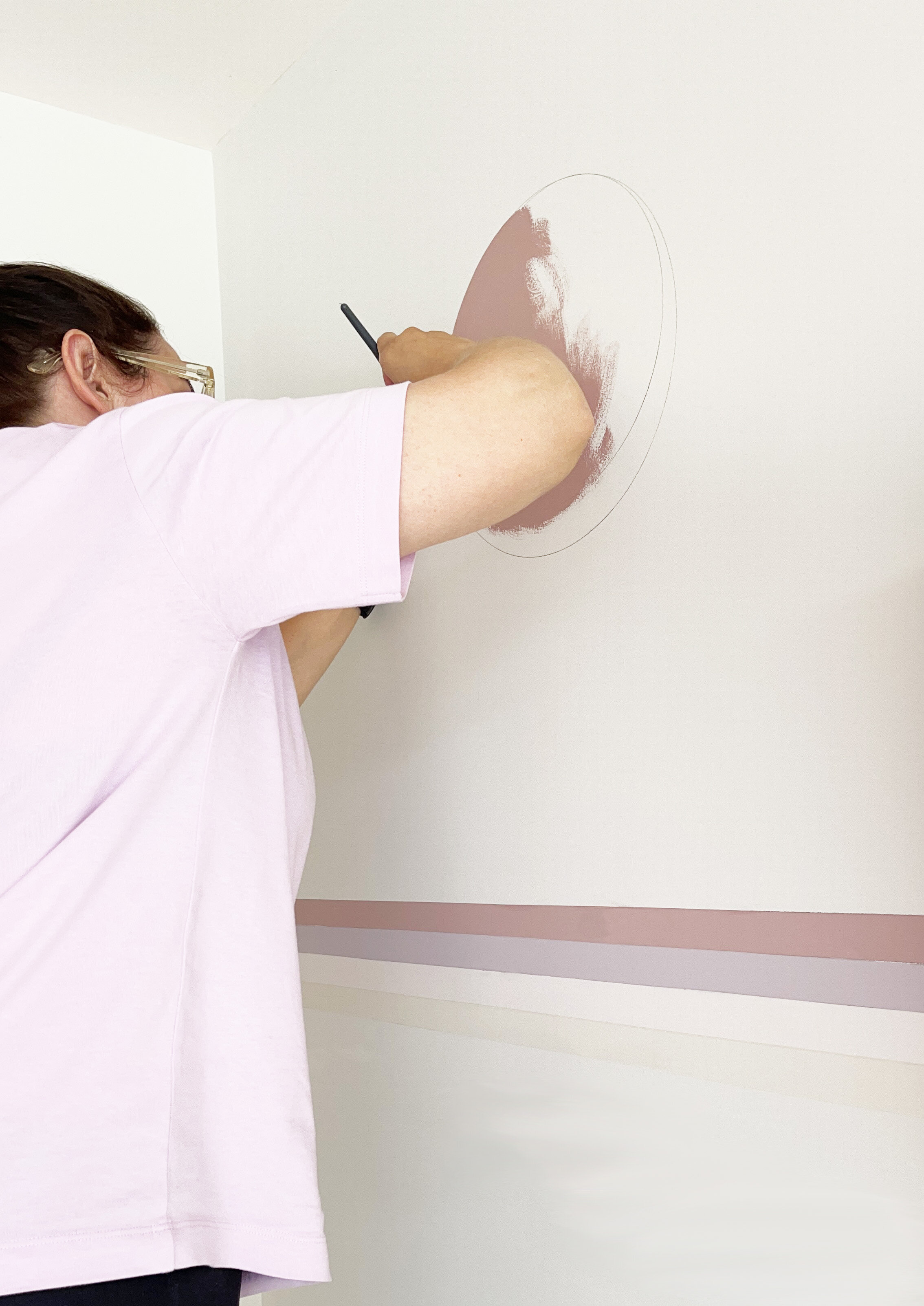
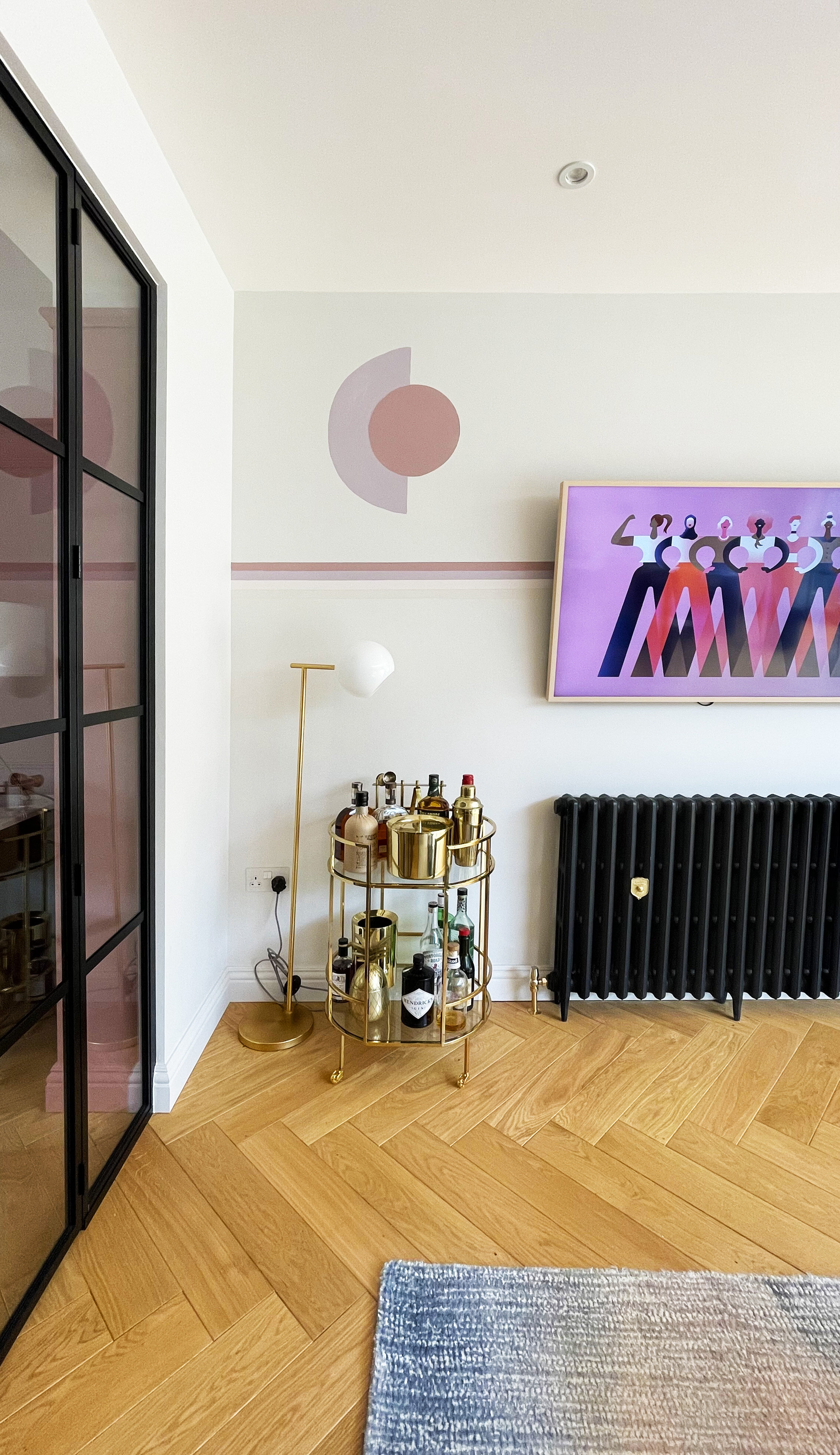
To draw the circle, I used a large round brass tray that I had laying around the house, and then filled it in with Dulux SimplyRefresh One Coat in shade Pressed Petal.

CREATING THE ARCH

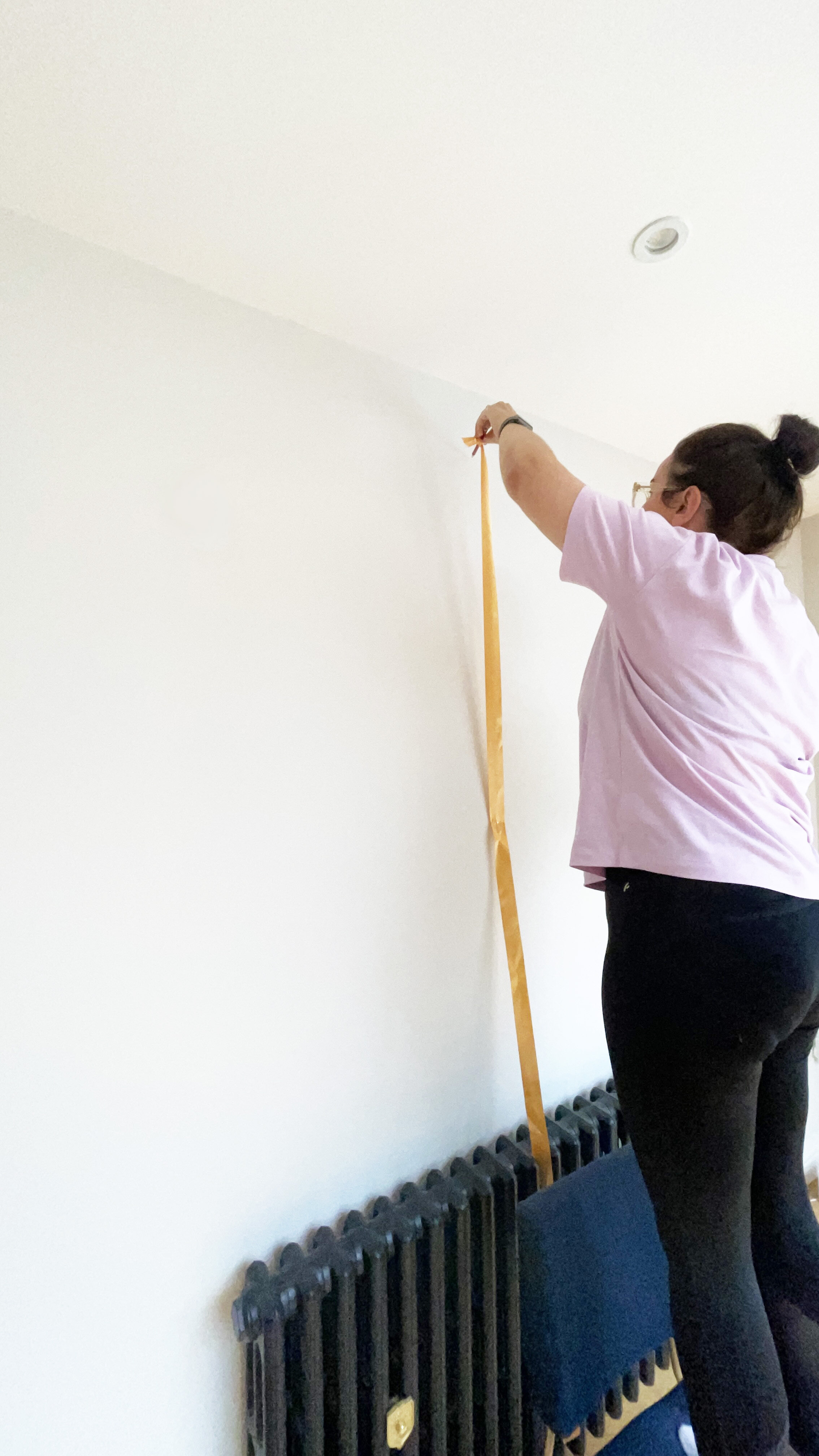
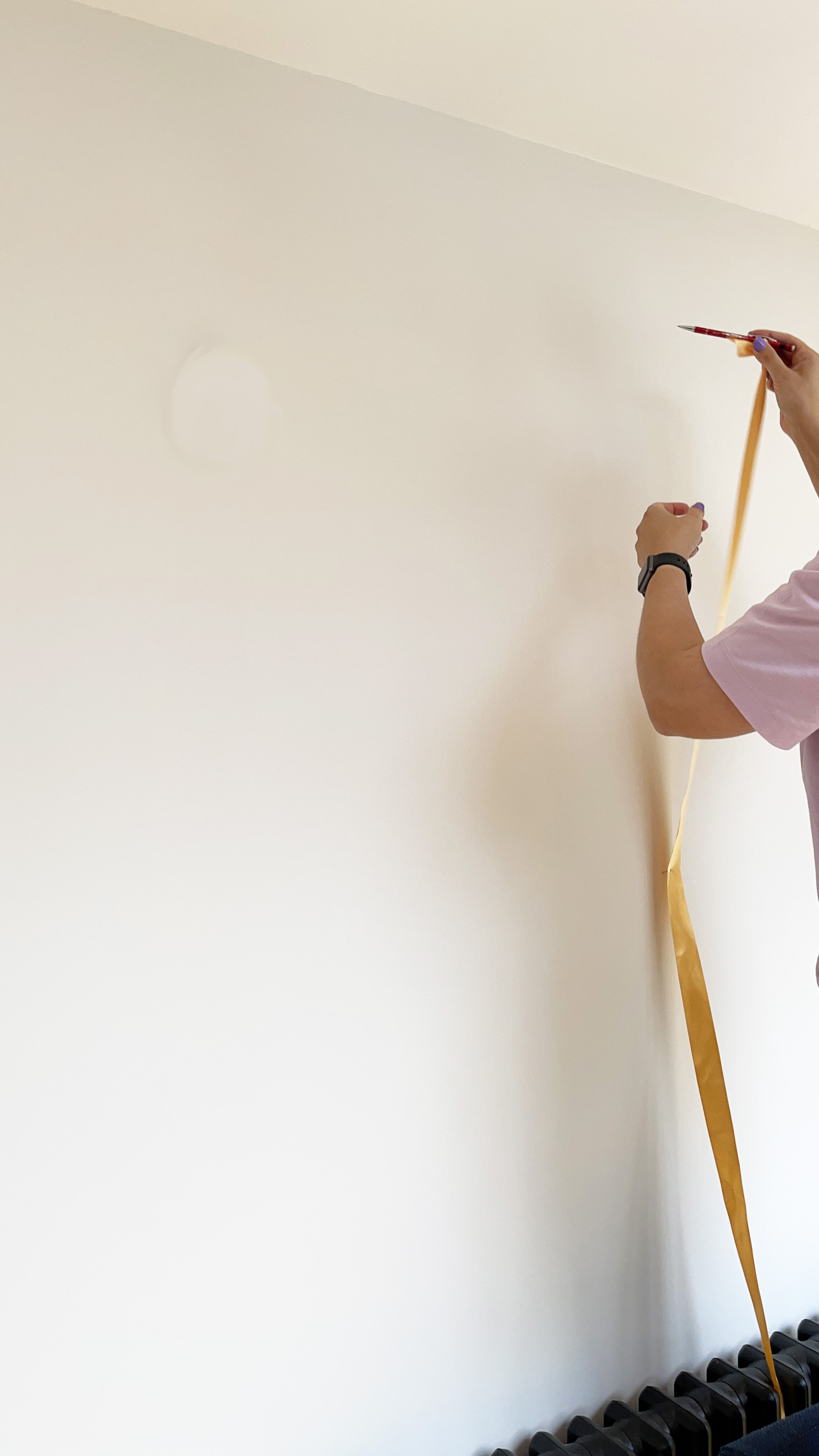
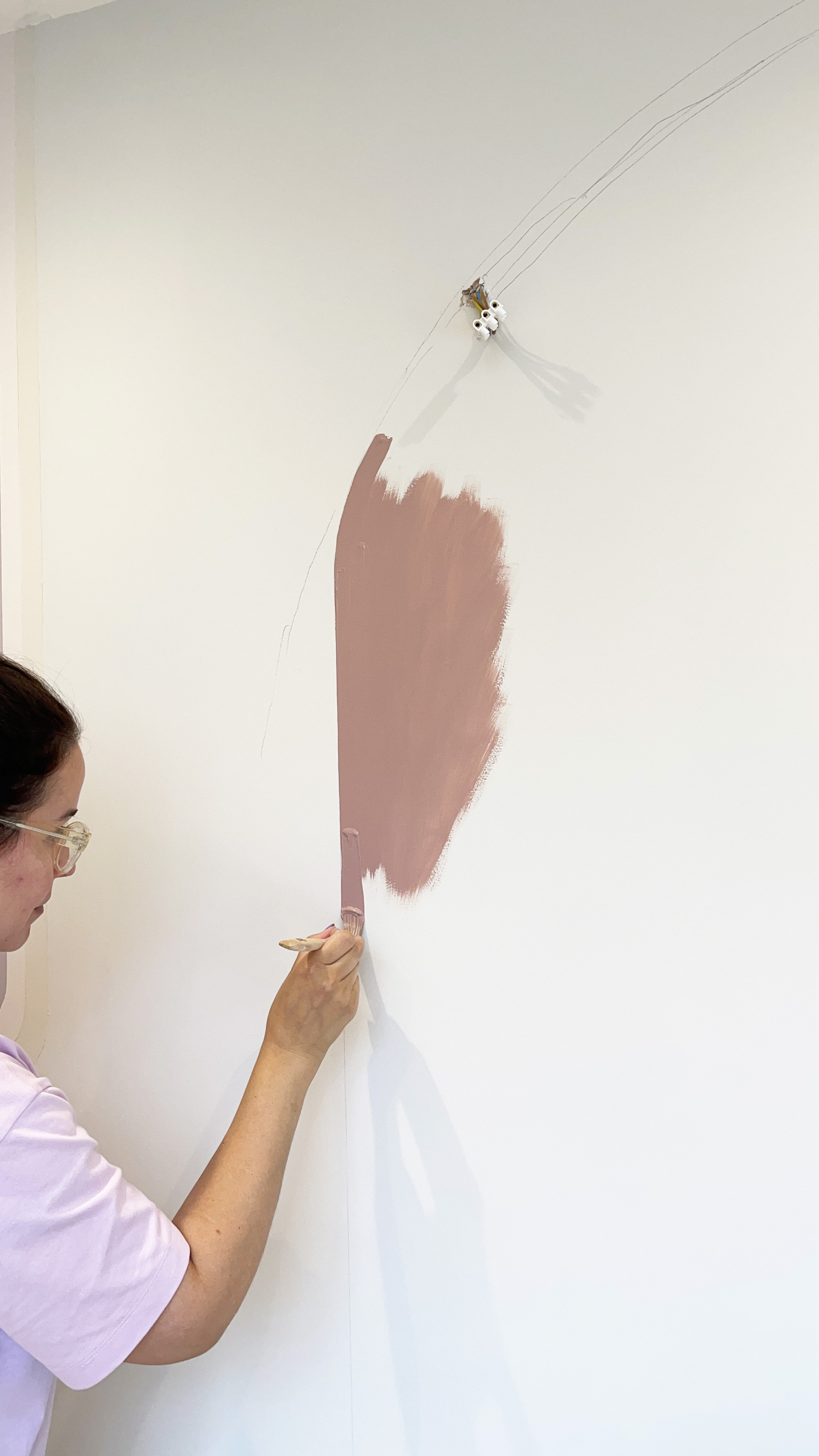
My design included an arch to the right hand side of the wall. To create an arch, you have to find the centre of the arch, then use a ribbon or a piece of string which you nail into the middle point, then attach a pencil and drawer out your perfect symmetrical arch, following the curve of the pencil. I used a piece of ribbon as we didn’t have any string.

I then painted the arch by freehand, as I had already used a spirit level to draw the perfectly straight sides to the arch.

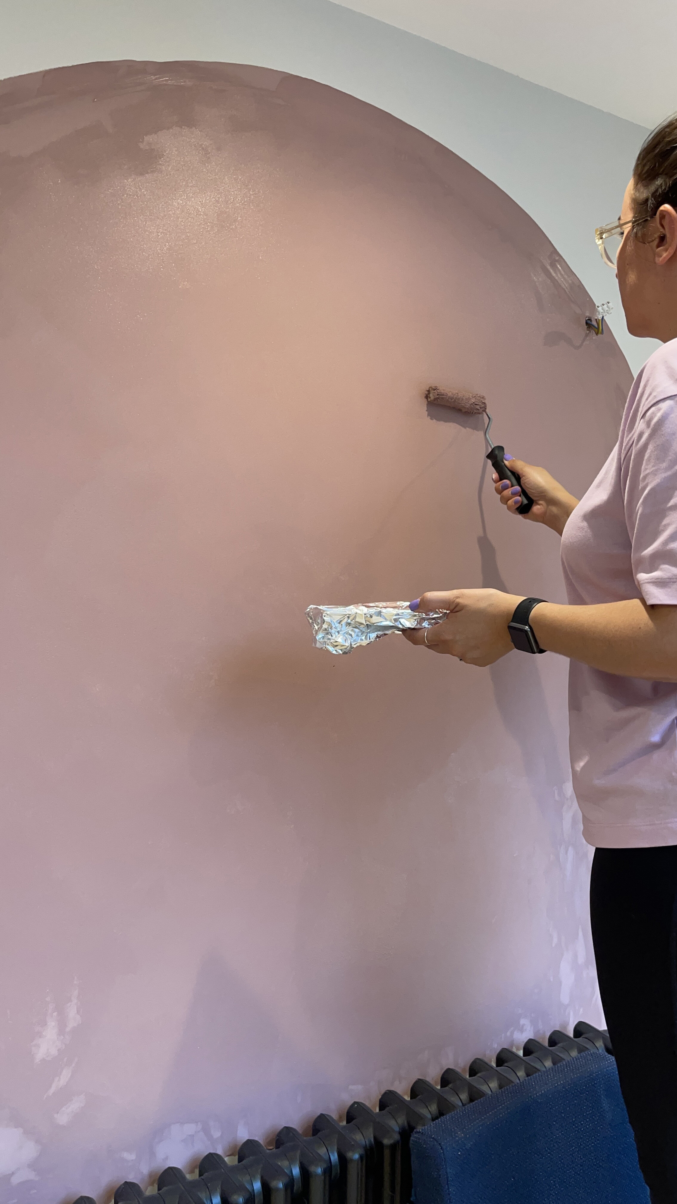
The photos below were taken as I was painting the arch in Dulux Simply Refresh One Coat in Pressed Petal when it still needed time to dry. I painted the edges by brush, and then used a roller for the centre of the arch.

Then once it the paint had dried I peeled off any remaining masking tape, washed my brushes and stepped back to have a look at my new fancy wall mural.

THE END RESULT

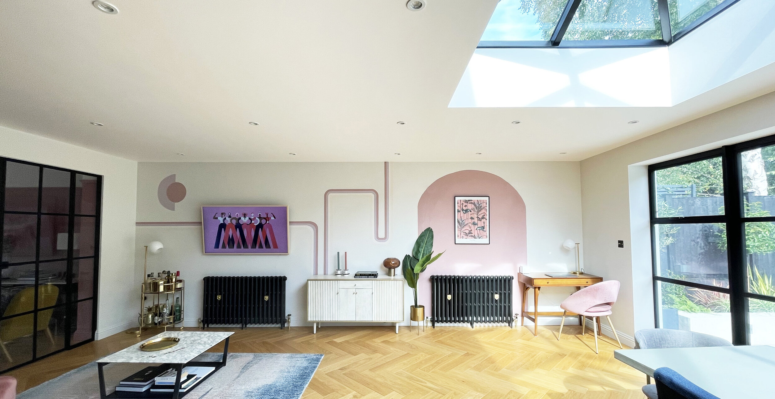
I’m really happy with the results. This took me just over one day to sketch out and paint, and its really transformed the space. I then shopped my own home by moving a sideboard from upstairs, down to fill this gap and re jigged a few bits around. I even changed the screen saver on my TV to match with the decor.

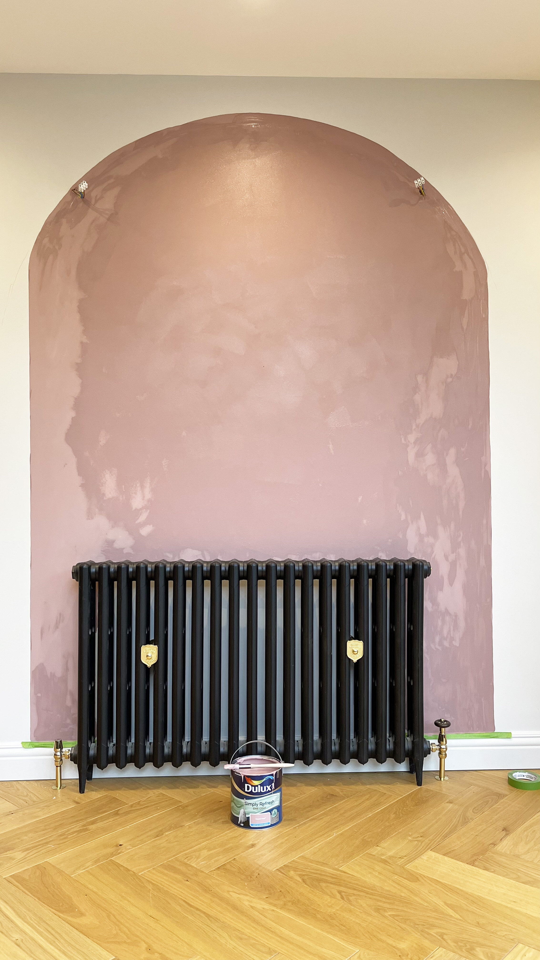
Pressed Petal painted curved arch, from the Dulux ‘Simply Refresh One Coat range.

Pressed Petal painted curved arch, from the DuluxSimply Refresh One Coat range.

I was really impressed with how thick the Simply Refresh One Coat from Dulux range was, and how great the coverage was. It really does go on in just one coat., so no need to hang around watching paint dry between coats, you can just get on with your project and have your room back in use in hours. A 2.5L tin will cover four walls of an average sized room.

What do you think? Would you be tempted to try out your own changing room wall mural?