HOW TO CREATE A PAINTED WALL MURAL, INSPIRED BY DULUX CHANGING ROOMS - AD

AD - This post is a paid partnership with Dulux, inspired by Dulux Changing rooms.

After an 18 year hiatus, my favourite 90’s TV show for all interior design lovers is back; Changing Rooms!

Changing Rooms re-launched in August 2021 and aired on Channel 4 in the UK, on Wednesdays at 8pm, and is being powered by non other than leading paint brand Dulux.

So what is Changing Rooms? Well, in a nutshell it’s a fun interior design TV show where we see two sets of homeowners from the same neighbourhood work against the clock to renovate a room in each other’s houses. They won’t be alone though, they’ll have the help of interior designers Jordan Cluroe and Russell Whitehead of 2LG Studio and Laurence Llewelyn-Bowen, whilst also having a skilled carpenter and joiner on hand; Tibby Singh.

It’s packed full of design and DIY hints and tips, teaching us all how to be crafty on a budget by upscaling and adding sparkle to unloved or outdated corners of our homes. It’s inspiring to watch how a room can be easily transformed with just a lick of paint.

I’ve been hugely inspired by watching Changing Rooms, and fancied updating a tired and boring wall within my home, by using some of the tips I’ve learnt whilst watching the show.

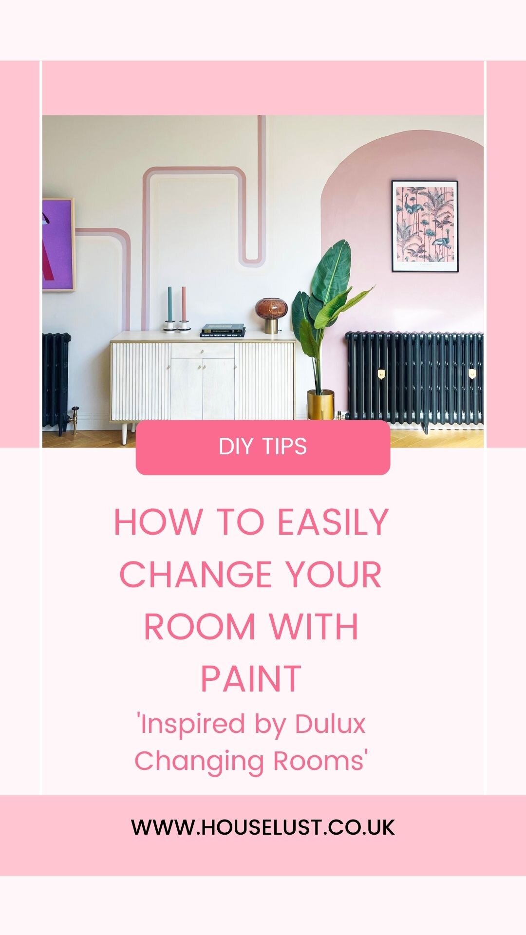
Today, in this blog post I’m going to show you how I took a drab empty white wall in my home, and added some fun and colour, which adds print and texture, whilst only using Dulux ‘Simply Refresh One coat’ paint’.

I decided I wanted to add a painted mural to my dining room wall. I’ve seen murals making a reappearance since 70’s trends returned this last year, and I love the idea of how just using masking tape, a spirit level and some house hold items for templates, you can create your own 70’s wall. So thats exactly what I did.

This is the wall in question. The opposite side of this wall is our kitchen which is a lot more interesting, I just seemed to have neglected this side after our renovation.

BEFORE

THE INSPIRATION

I love the simplicity of these ideas, using masking tape and a spirit level. They make such an impact without having to add tones of layers of paint.

Image credit Very Gay Paint .

Image credit Very Gay Paint .

Image credit : Forget Me Via Pinterest.

Image credit : Forget Me Via Pinterest.

THE PROCESS

The first thing I did was mark out a rough plan of where I wanted to add the lines and curves. You can do this on a bit of paper, I used Adode illustrator just so I could visualise the curves and lines with the correct proportions.

I then decided on the paint and colours. I wanted my wall mural to be quite harmonious, so I chose colours from Dulux Simply Refresh One Coat Pinks, Violets and yellow range, with an added neutral, as I knew the coverage would be perfect, and I’d only have to do one coat to save me time.

How I designed my wall mural.

How I designed my wall mural.

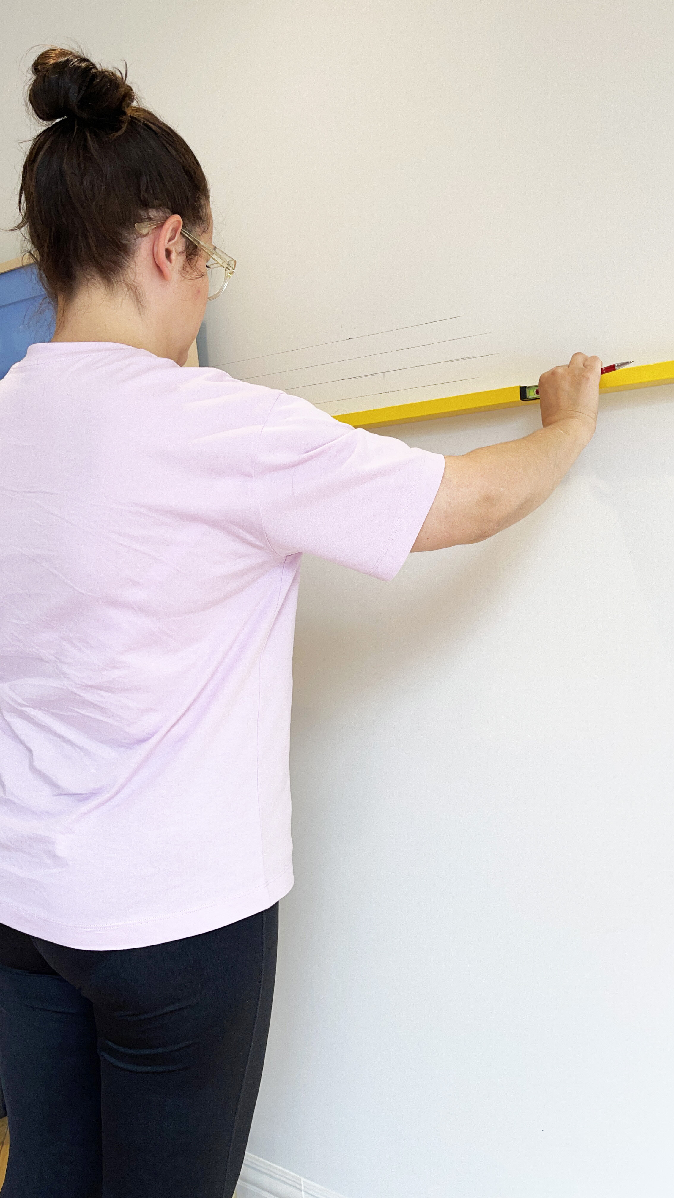
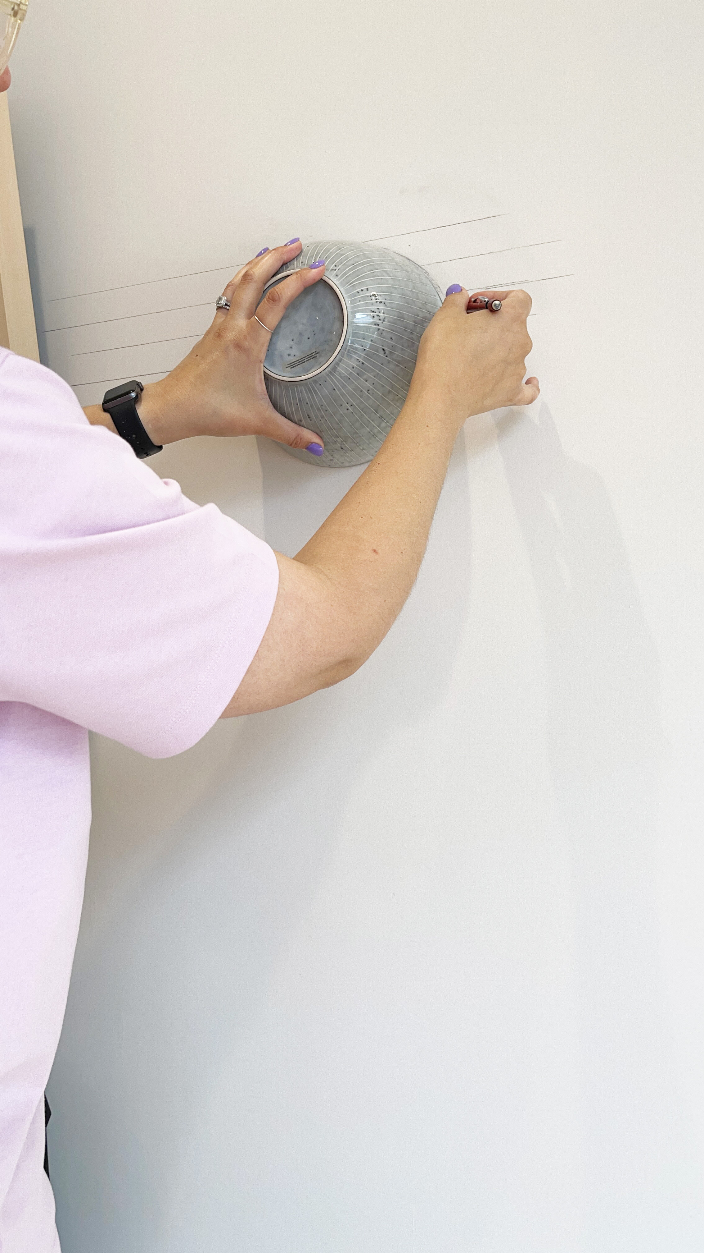
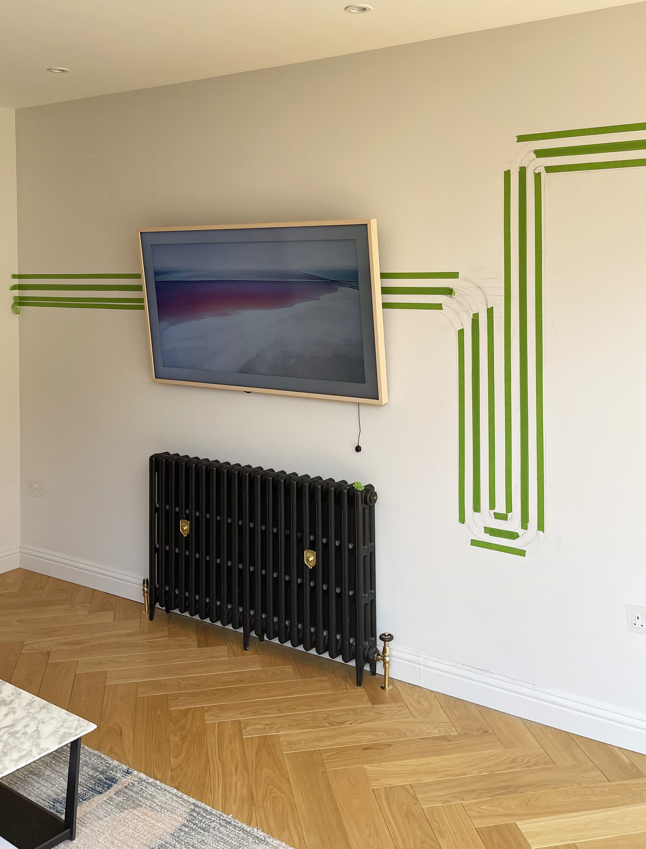
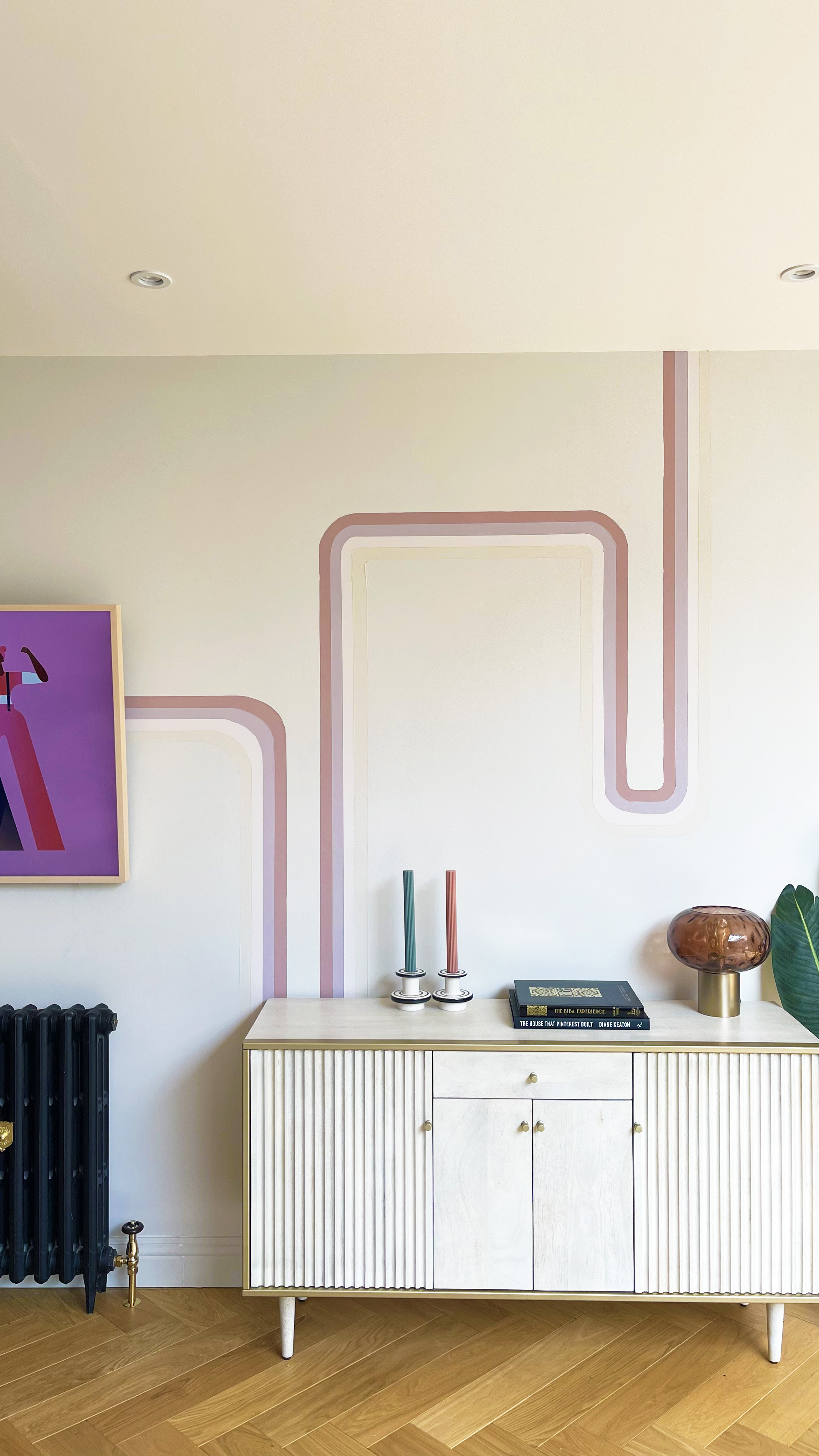
I then got to work on drawing all the lines in pencil on the wall. I used a spirit level to make sure the lines were straight , and I used a kitchen bowl to do the curves.

I measured each painted line to be 3cm wide each.

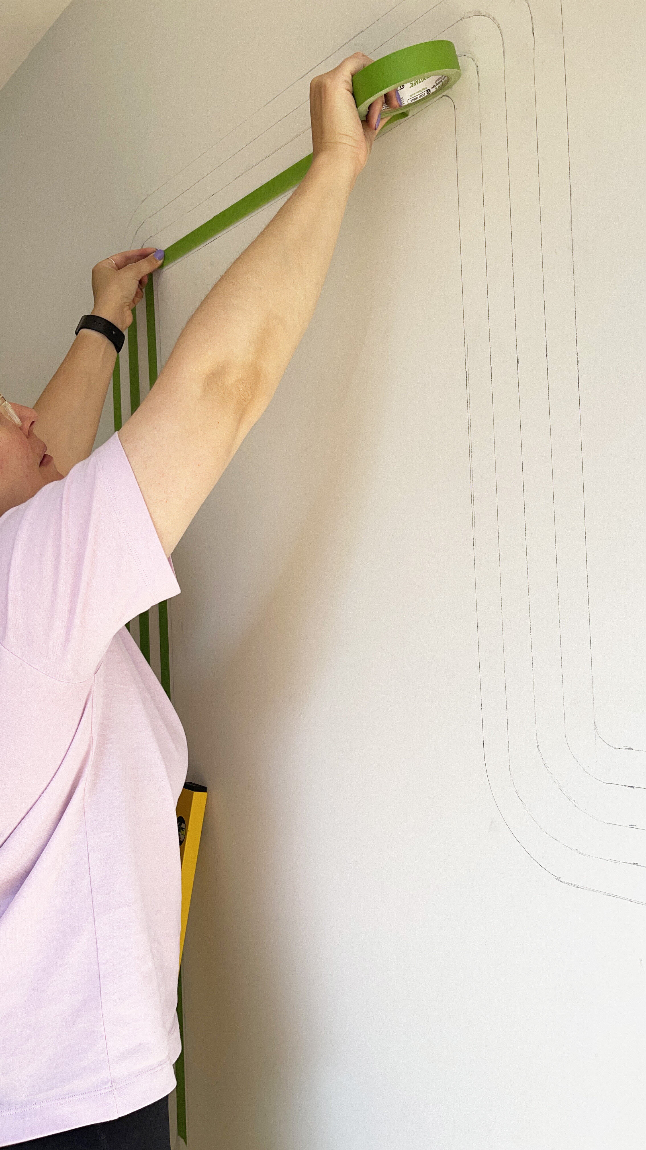
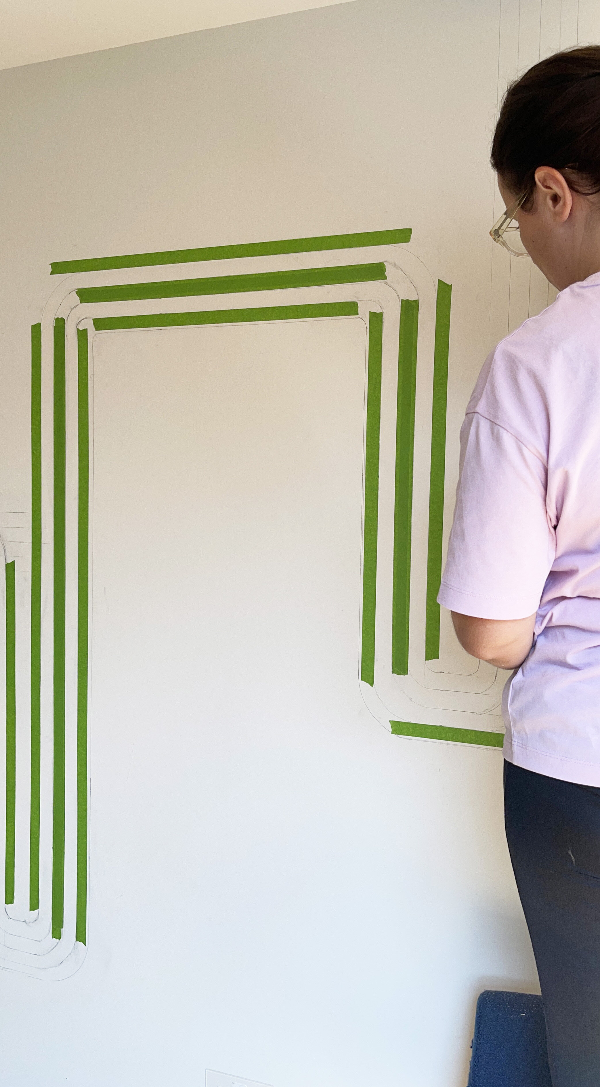
I then started to mask the areas using a general masking tape which is suitable for decorating, to give me the ultimate straight lines for decorating.

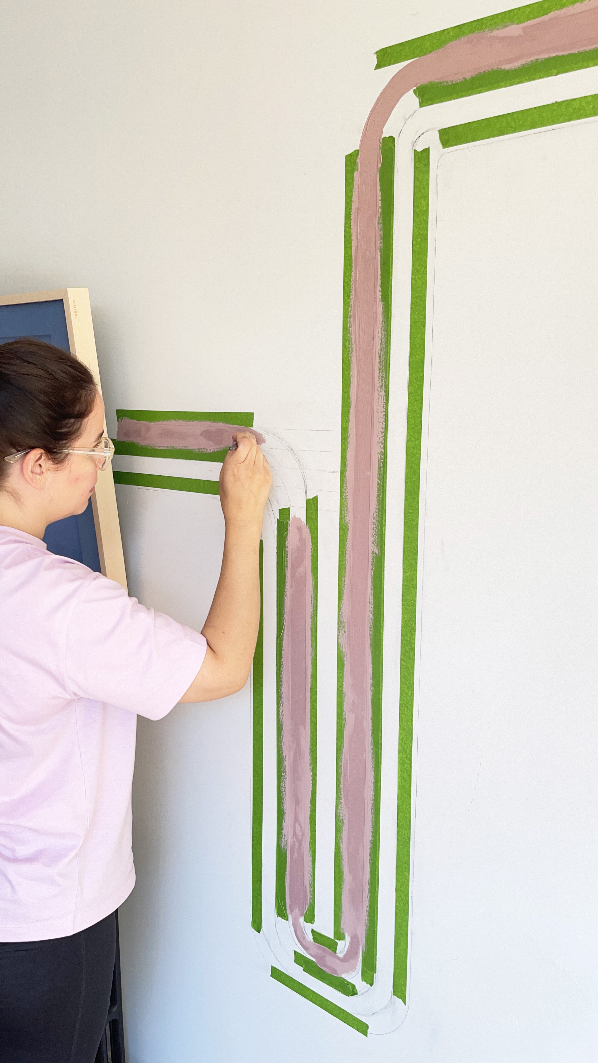
I then got to work on the painting , choosing to paint the curves by free hand as I has already marked out the lines in pencil.

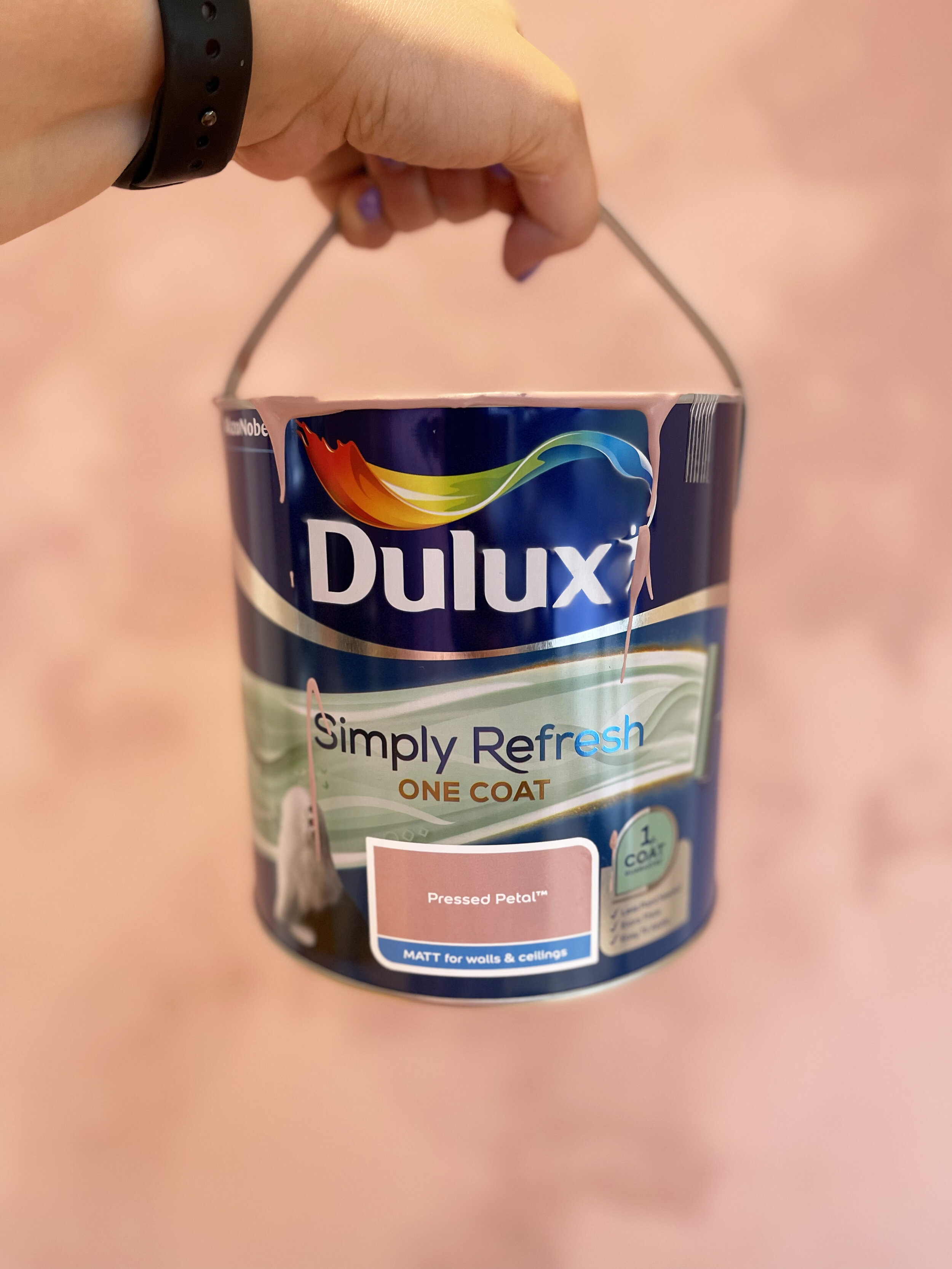
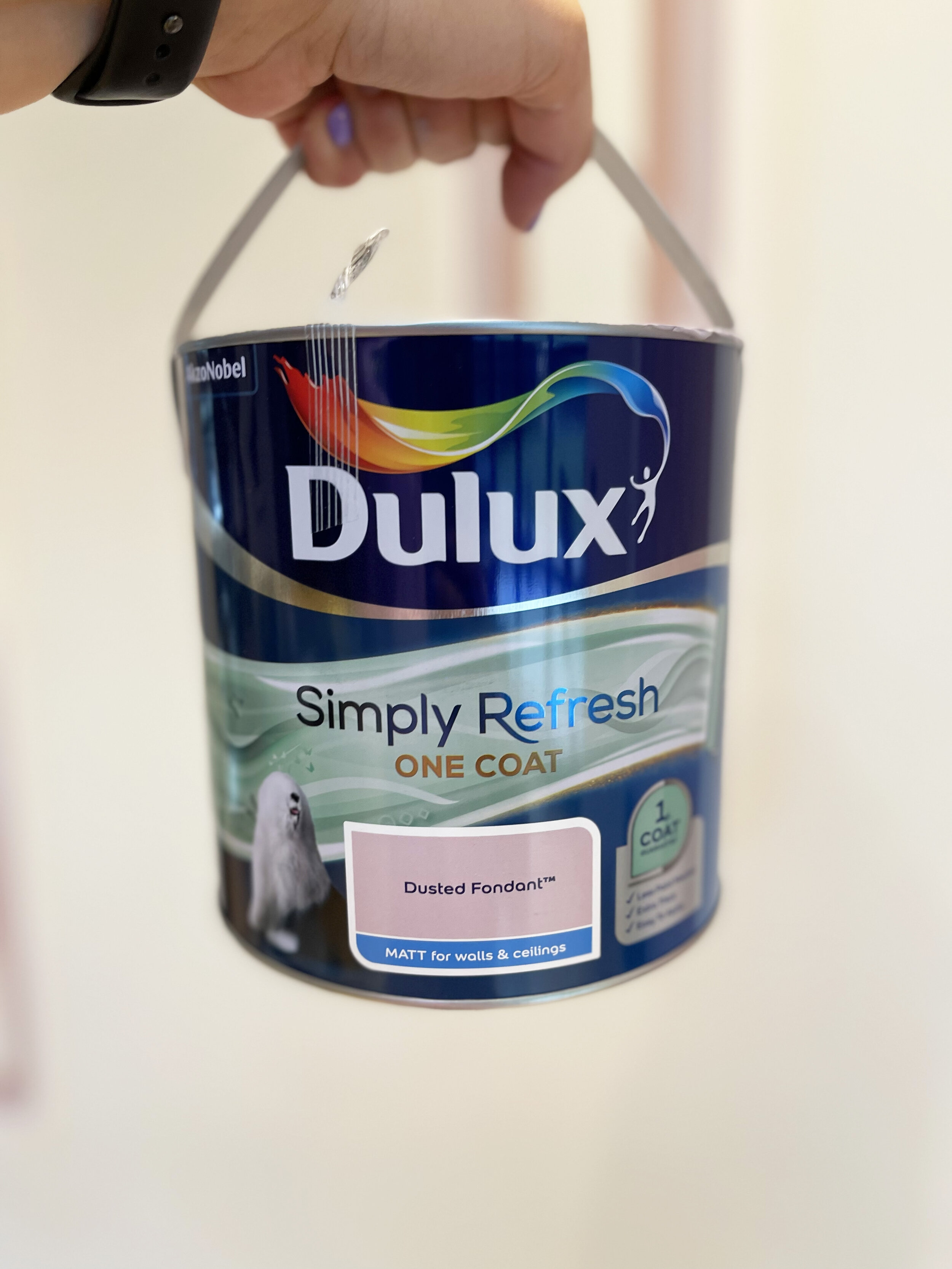
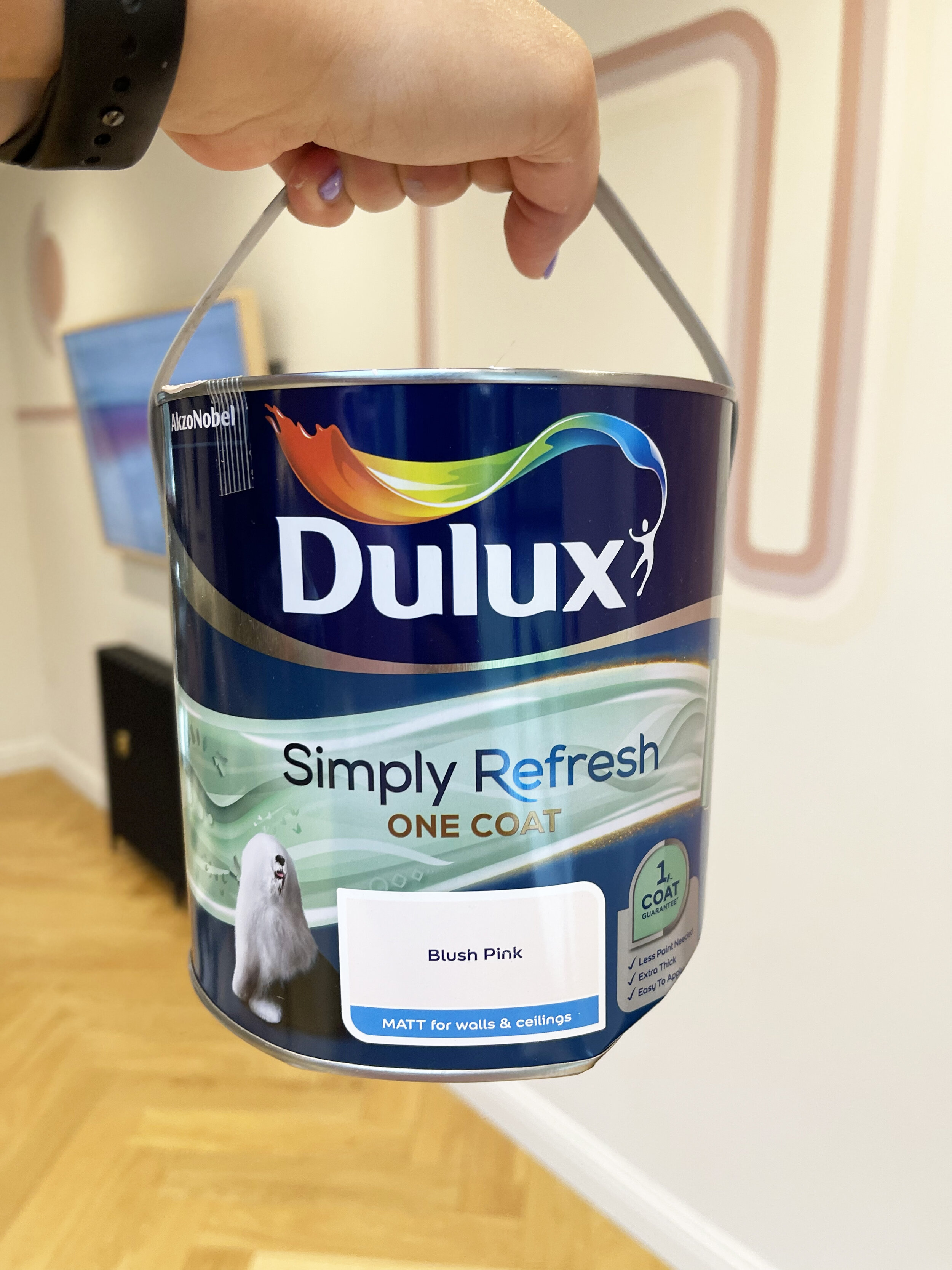
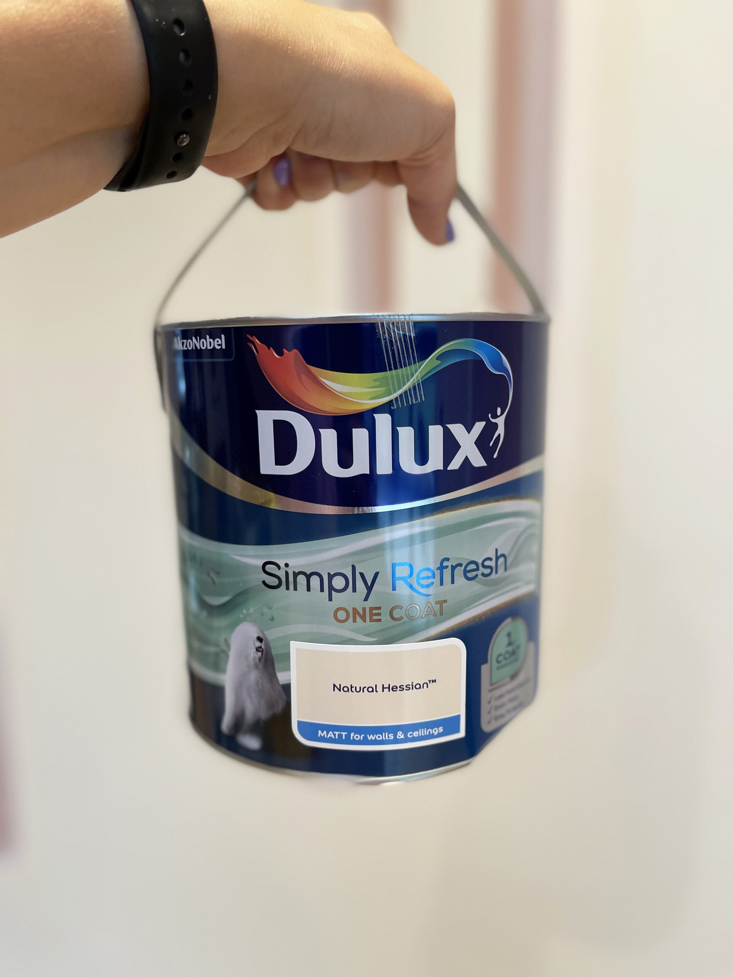
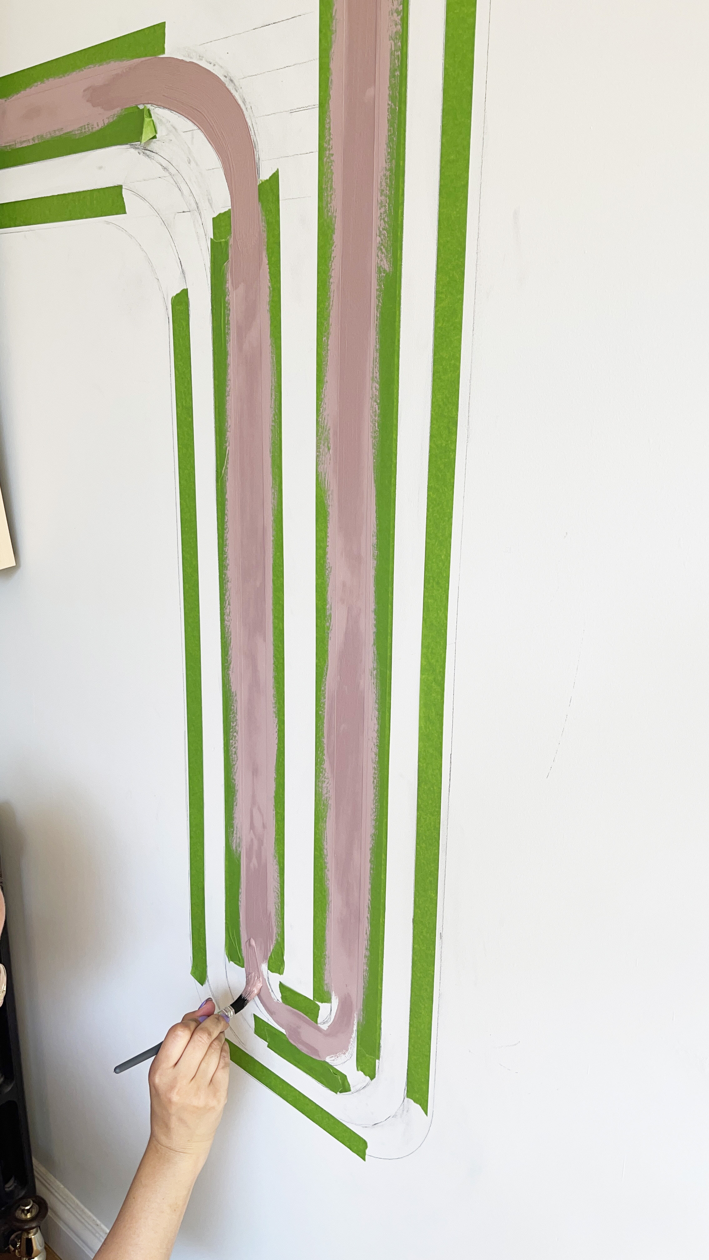
I started with the darkest paint colour on the outside line which was Dulux Simply Refresh One Coat in Pressed Petal, then did the third line which Dulux Simply Refresh One Coat in Blush. Once these had dried, I peeled away the masking tape and re masked up the other two lines which were Dusted Fondant as the second line and Natural Hessian as the fourth. All From Dulux Simply Refresh one Coat range.

After painting the first and third line, I waited for the paint to dry, before peeling back the masking tape, to then re apply new tape for the second and fourth colour blocked line.

After painting the first and third line, I waited for the paint to dry, before peeling back the masking tape, to then re apply new tape for the second and fourth colour blocked line.

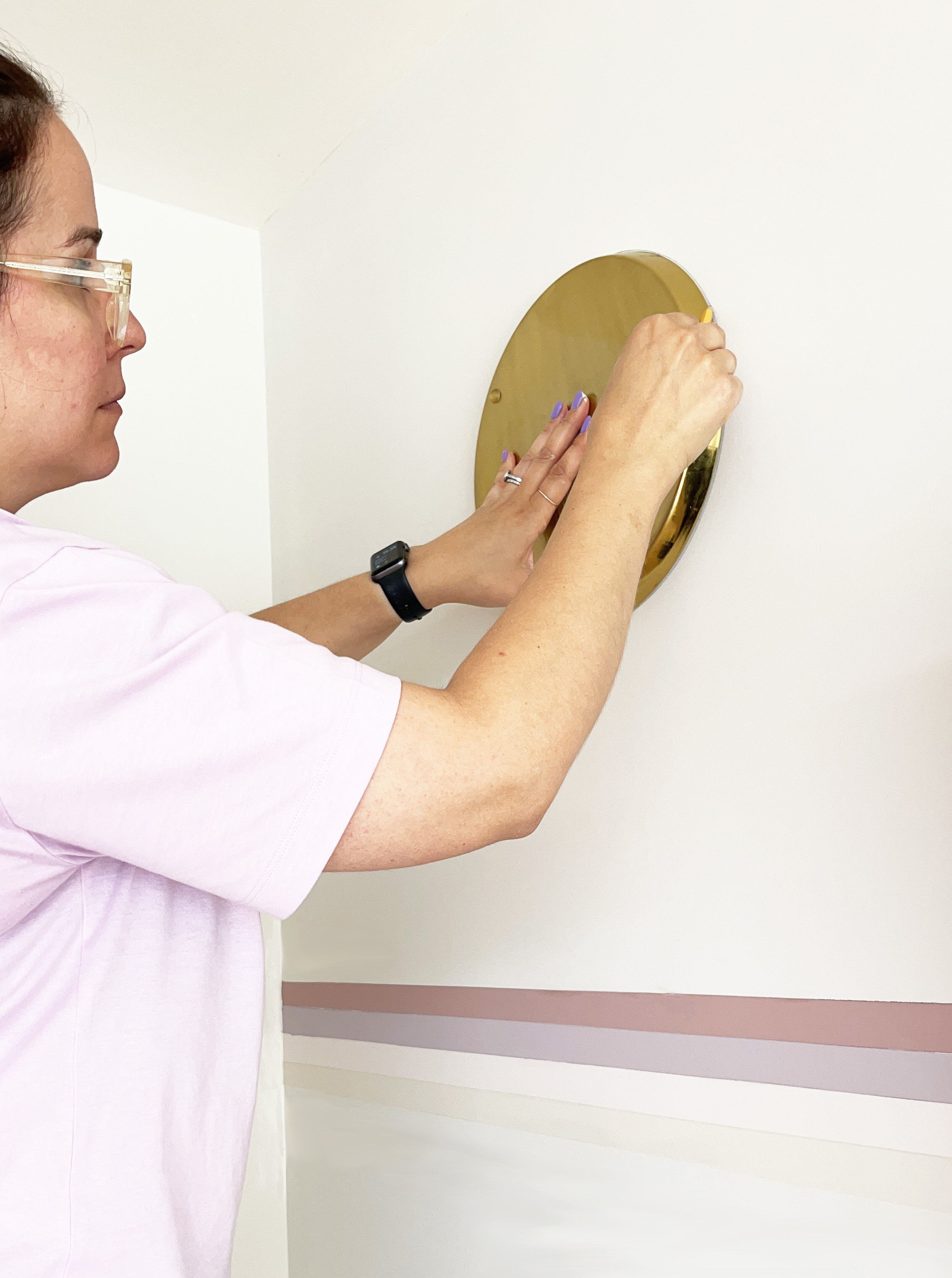
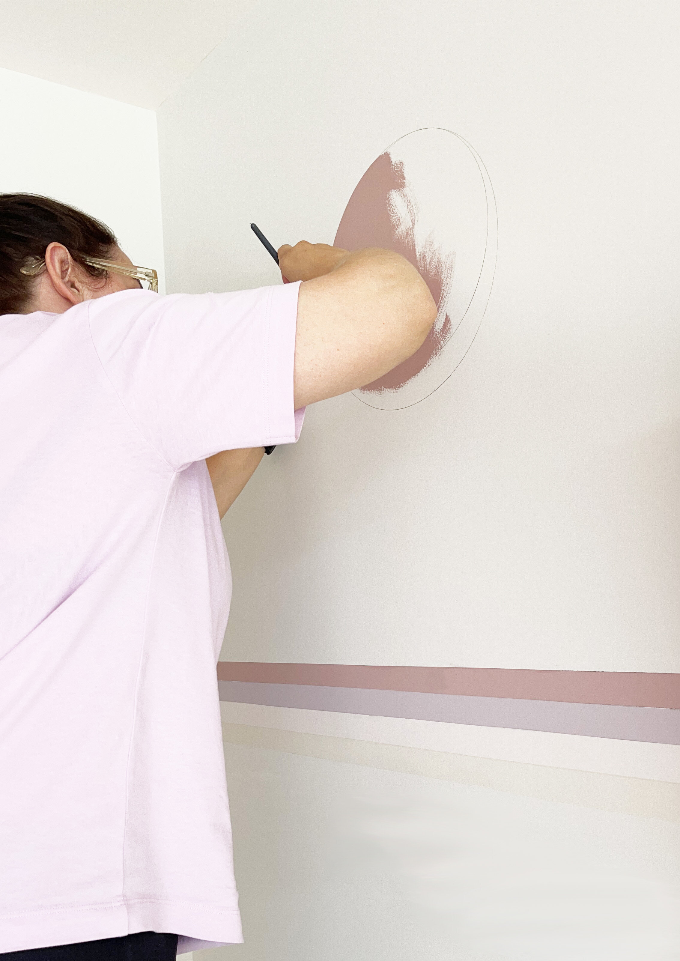
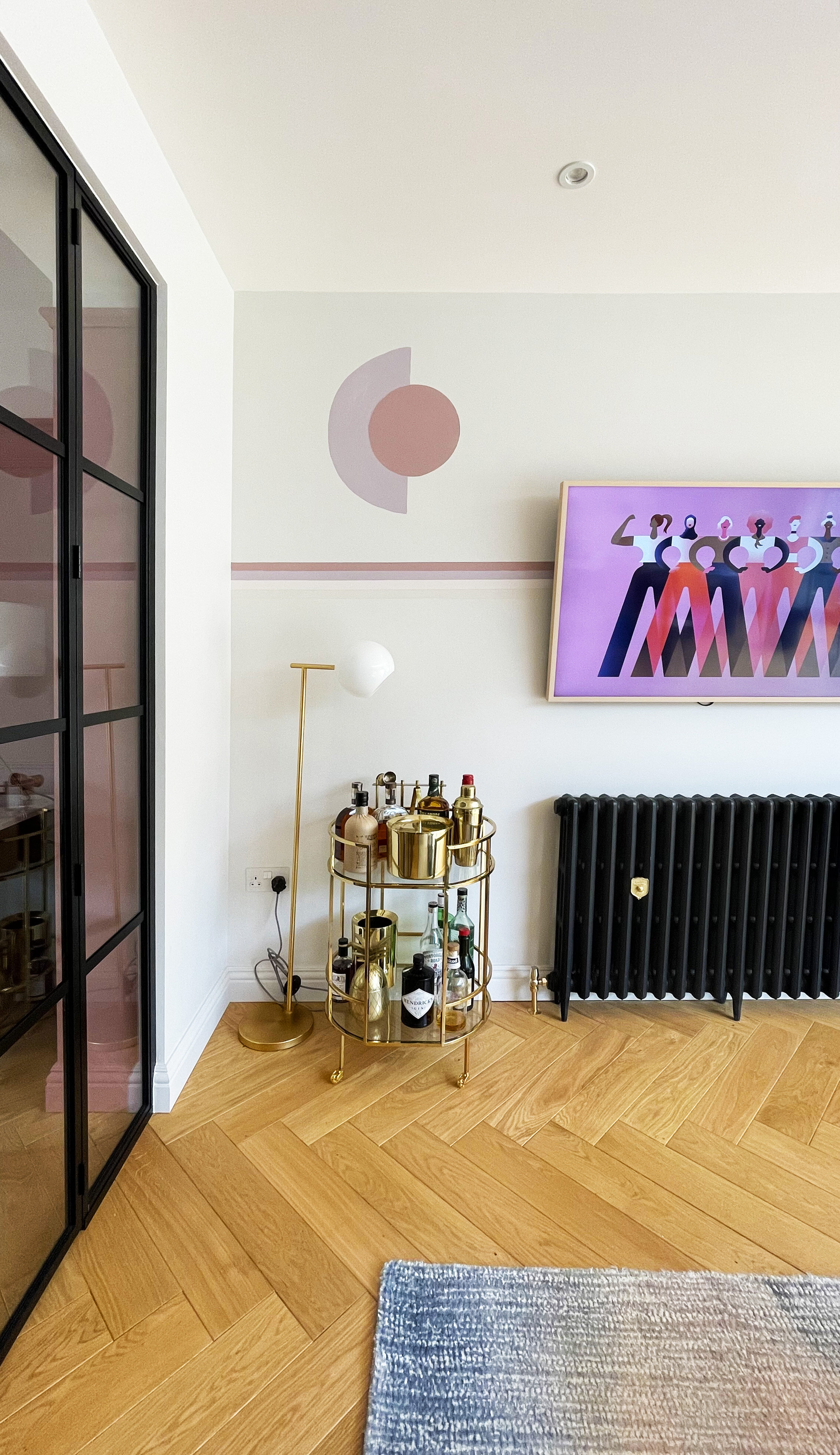
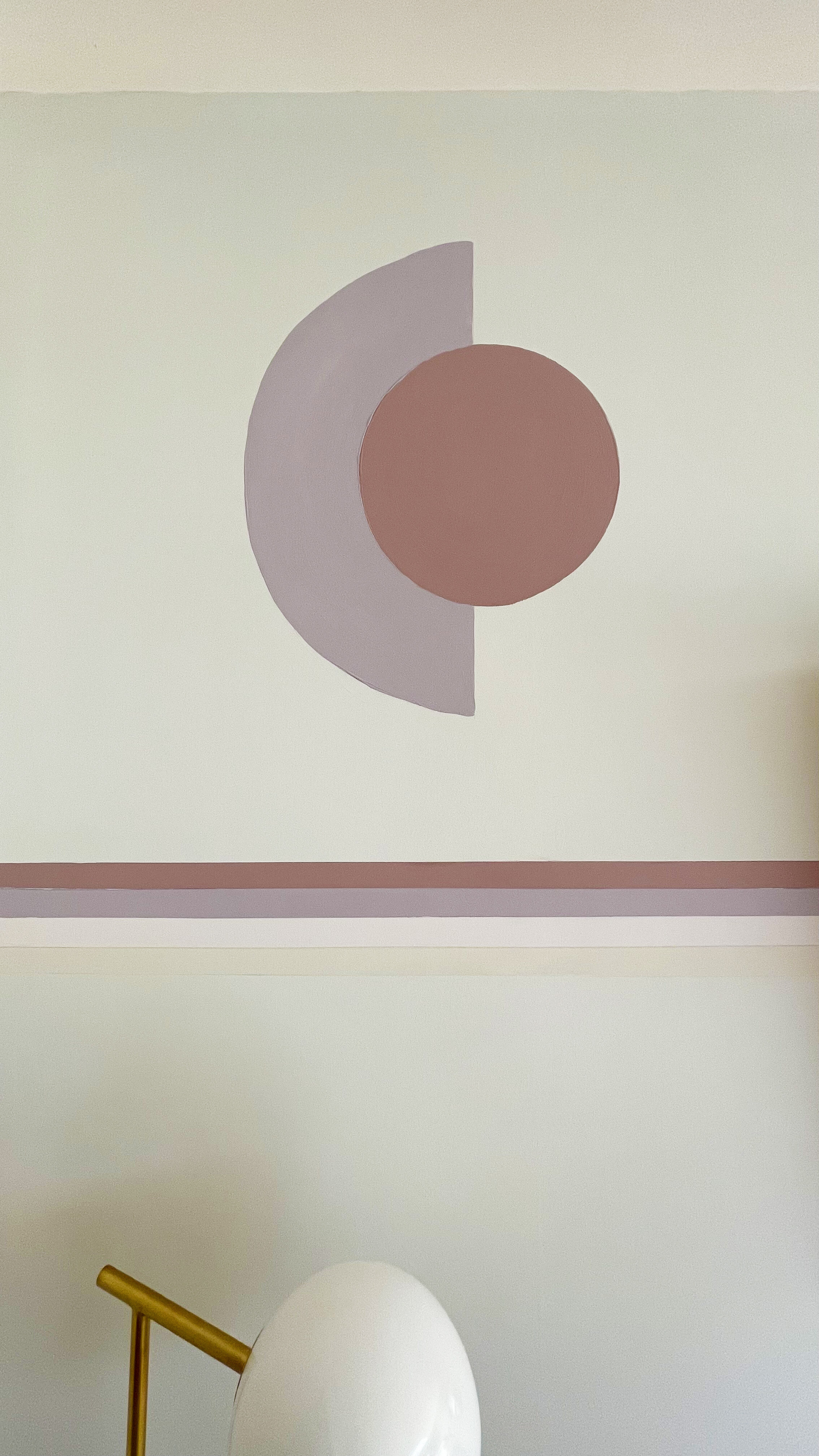
To draw the circle, I used a large round brass tray that I had laying around the house, and then filled it in with Dulux SimplyRefresh One Coat in shade Pressed Petal.

CREATING THE ARCH

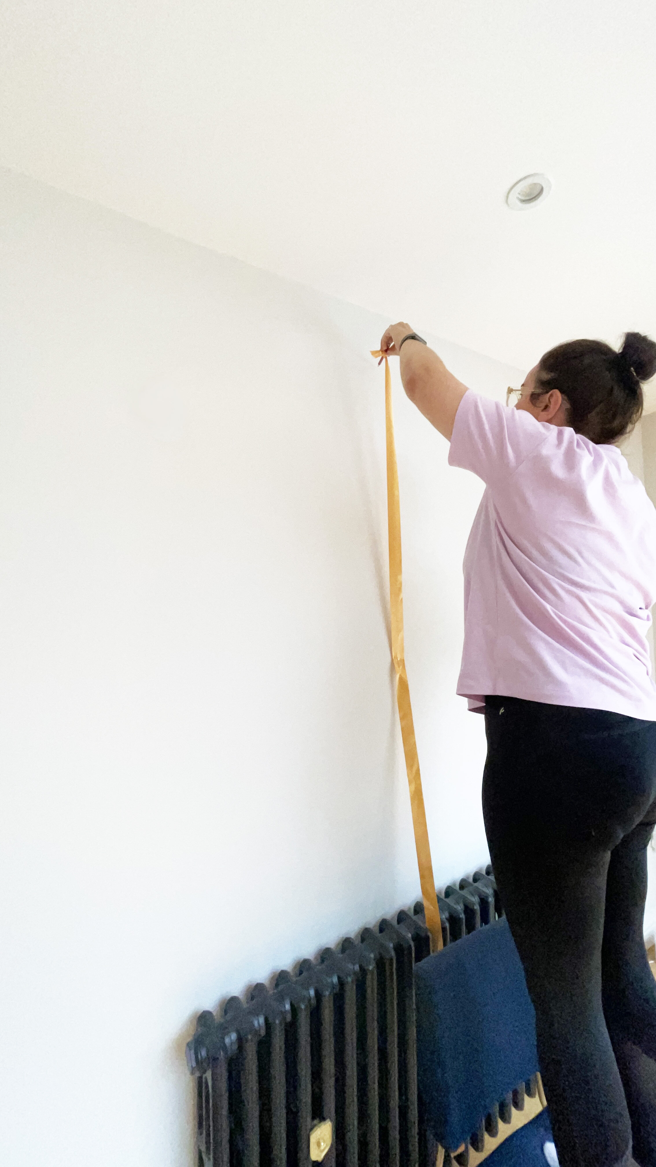
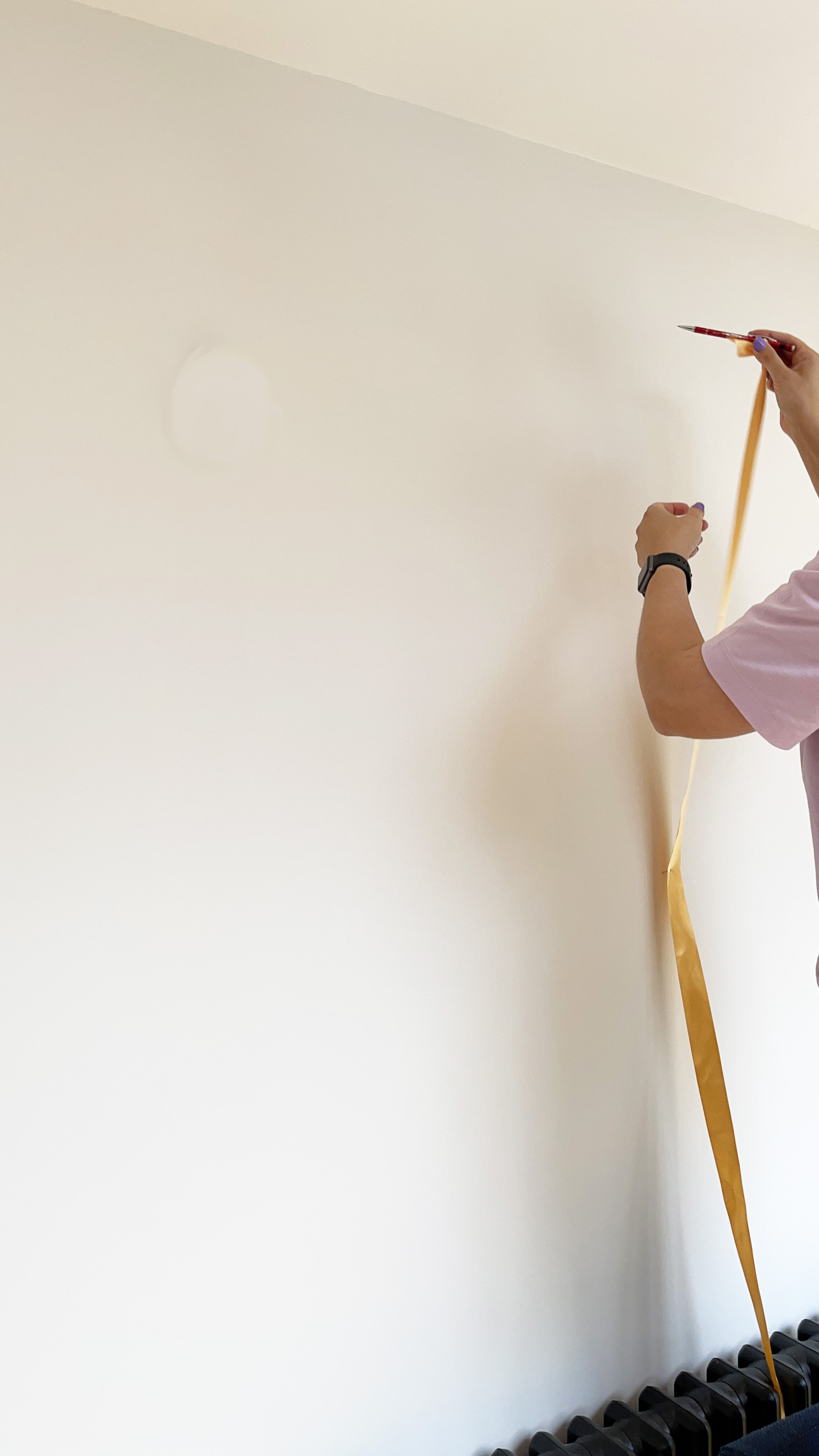
My design included an arch to the right hand side of the wall. To create an arch, you have to find the centre of the arch, then use a ribbon or a piece of string which you nail into the middle point, then attach a pencil and drawer out your perfect symmetrical arch, following the curve of the pencil. I used a piece of ribbon as we didn’t have any string.

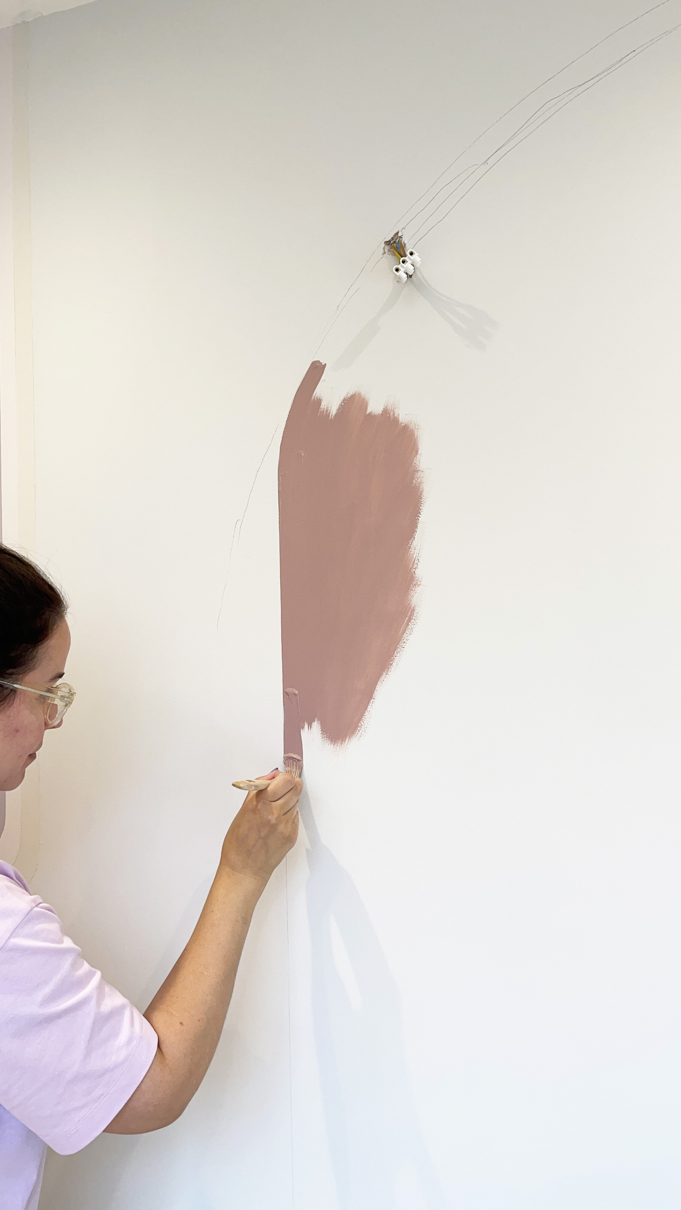
I then painted the arch by freehand, as I had already used a spirit level to draw the perfectly straight sides to the arch.

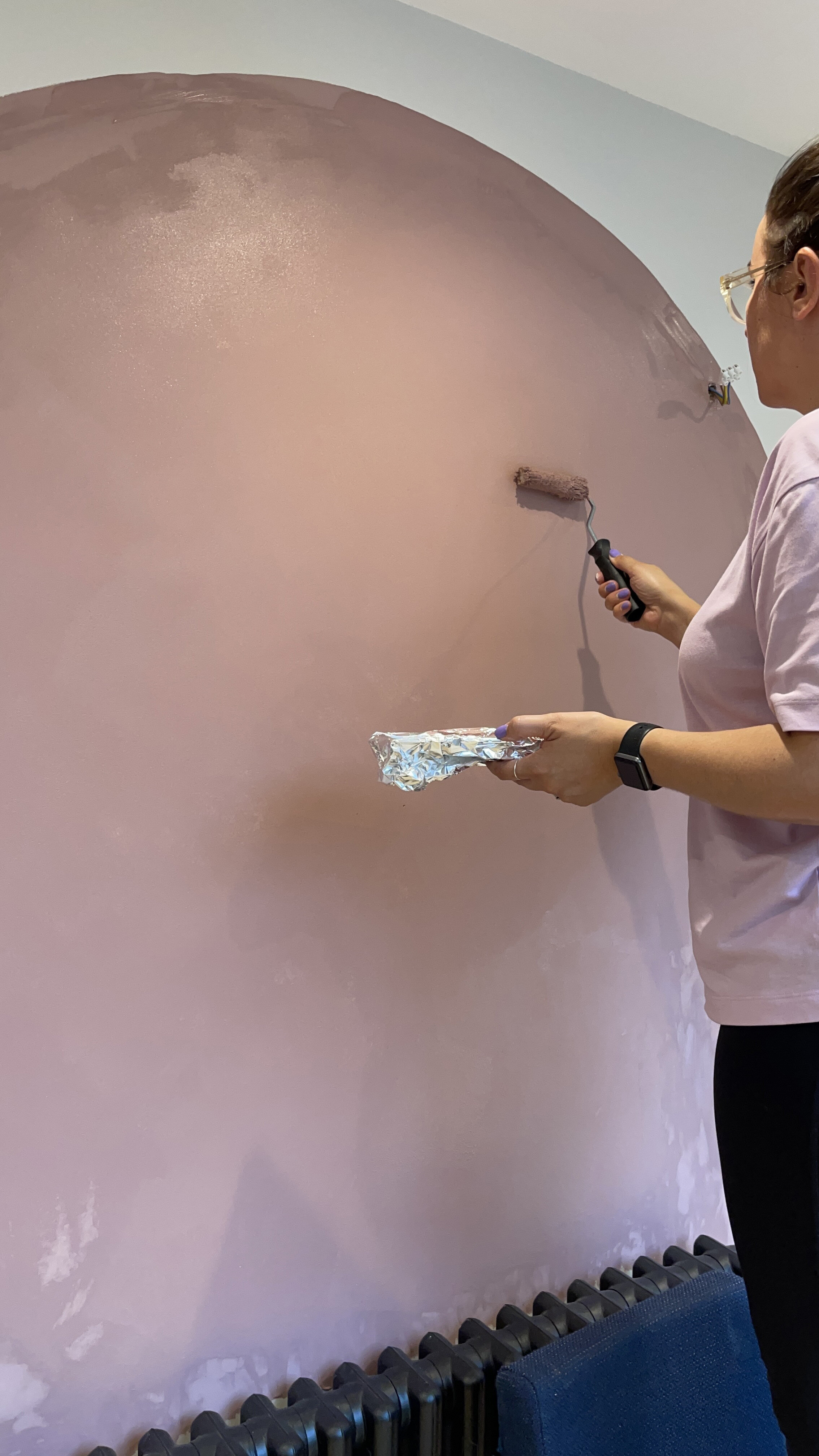
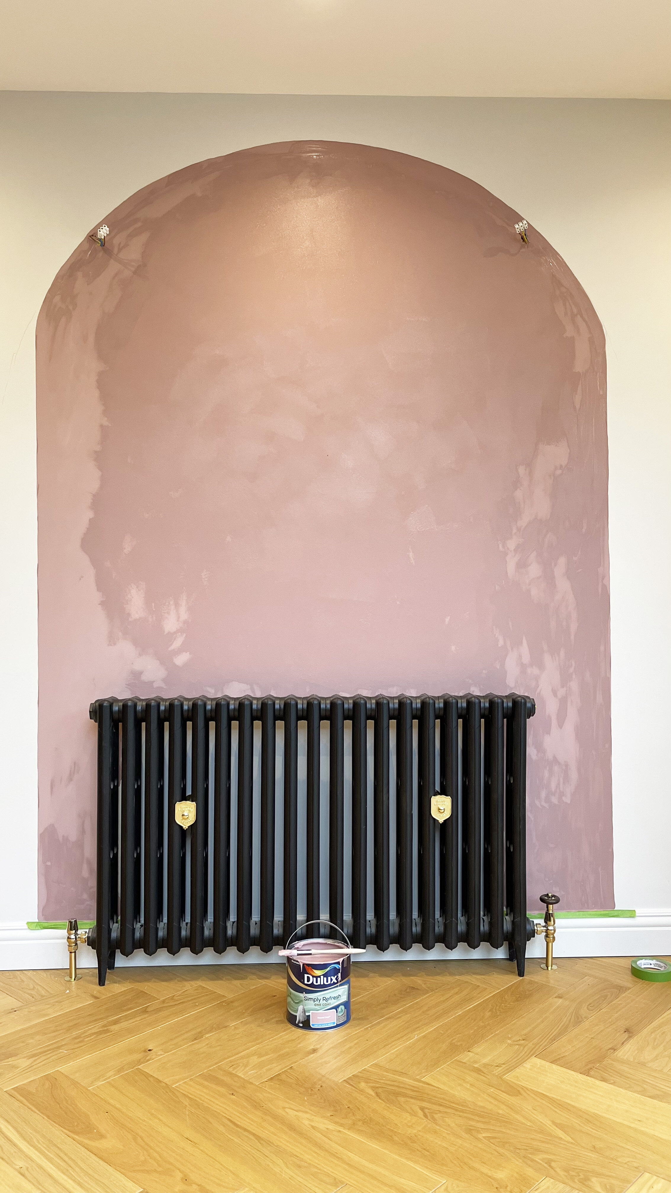
The photos below were taken as I was painting the arch in Dulux Simply Refresh One Coat in Pressed Petal when it still needed time to dry. I painted the edges by brush, and then used a roller for the centre of the arch.

Then once it the paint had dried I peeled off any remaining masking tape, washed my brushes and stepped back to have a look at my new fancy wall mural.

THE END RESULT

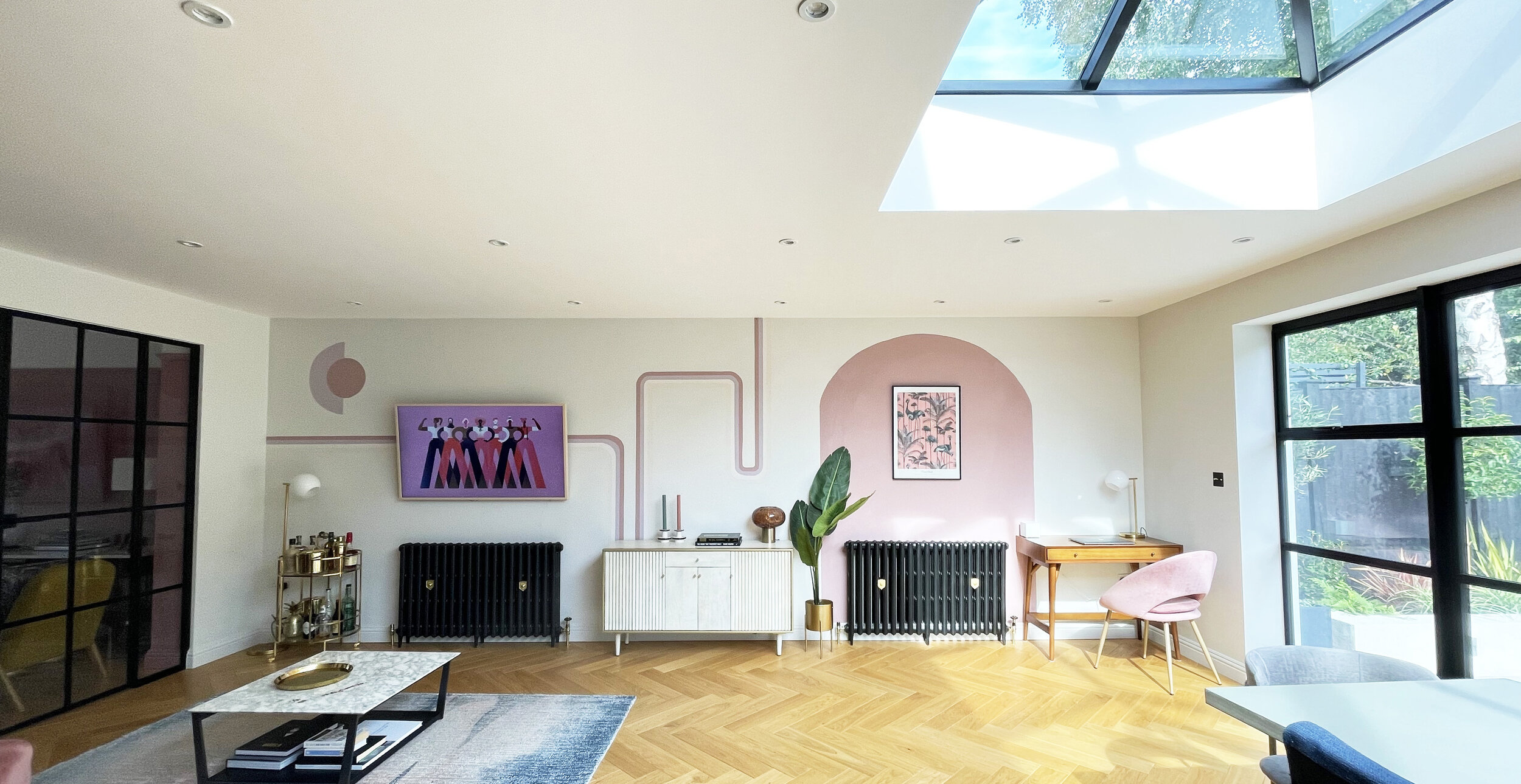
I’m really happy with the results. This took me just over one day to sketch out and paint, and its really transformed the space. I then shopped my own home by moving a sideboard from upstairs, down to fill this gap and re jigged a few bits around. I even changed the screen saver on my TV to match with the decor.

Pressed Petal painted curved arch, from the Dulux ‘Simply Refresh One Coat range.

Pressed Petal painted curved arch, from the DuluxSimply Refresh One Coat range.

I was really impressed with how thick the Simply Refresh One Coat from Dulux range was, and how great the coverage was. It really does go on in just one coat., so no need to hang around watching paint dry between coats, you can just get on with your project and have your room back in use in hours. A 2.5L tin will cover four walls of an average sized room.

What do you think? Would you be tempted to try out your own changing room wall mural?

RENOVATION UPDATE: HALLWAY TOUR (IN COLLABORATION WITH DIVINE SAVAGES)

hallway tour with divine savages

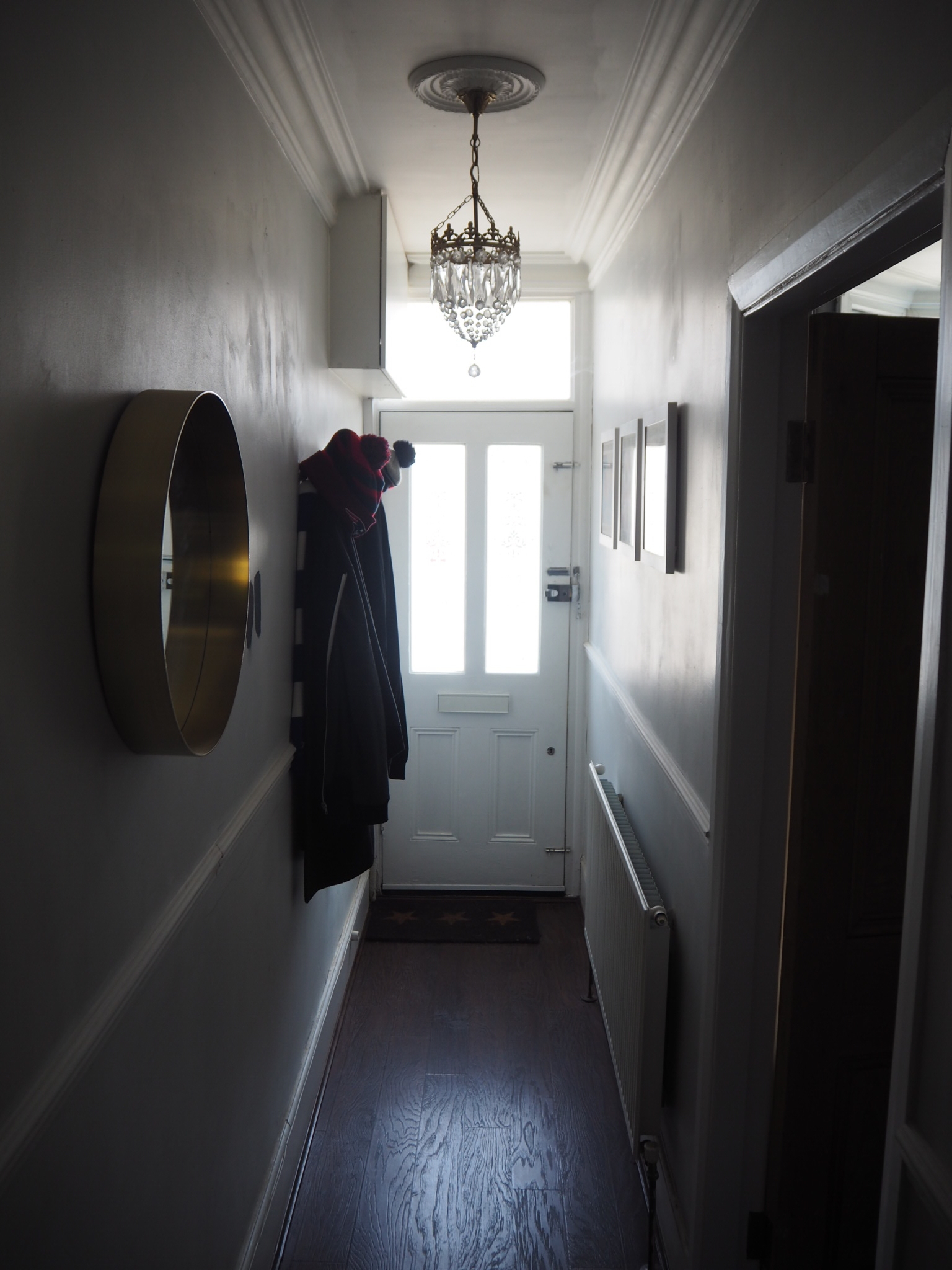
The hallway always felt like the smallest room in the house. It's only 90cm wide in some parts, and it's narrow width and steep stairs were bland and dusty from the loft conversion.

In turns out, this project was one of our biggest in terms of decoration and judging by the number of rolls of wallpaper we got through (11 rolls to be exact). 

I did a blog post back in June on our Hallway plans using the fabulous Divine Savages Deco Martini wallpaper in Blush, back with Farrow and Ball's Railings, separated by a Dado rail which my dad put in, and I can now say it's now finished. Okay, so technically I still want to add some more artworks and buy a carpet runner but for now, its finished. And what a difference it makes. 

Ceiling Light - Homesense £29.99, Wallpaper- Divine Savages Deco Martini Blush £140 per roll, Paint- Farrow and Ball Railings, Rug Runner- Wayfair £99, Brass mirror- Made.com £99, Coat Hooks - West Elm £69. 

Ceiling Light - Homesense £29.99, Wallpaper- Divine Savages Deco Martini Blush £140 per roll, Paint- Farrow and Ball Railings, Rug Runner- Wayfair £99, Brass mirror- Made.com £99, Coat Hooks - West Elm £69. 

Lets just take a minute to appreciate the fringed beauty of a light hanging in the hallway. Not only was it only £29.99 from my local homesense, but it's also bang on trend according to my recent living.etc magazine

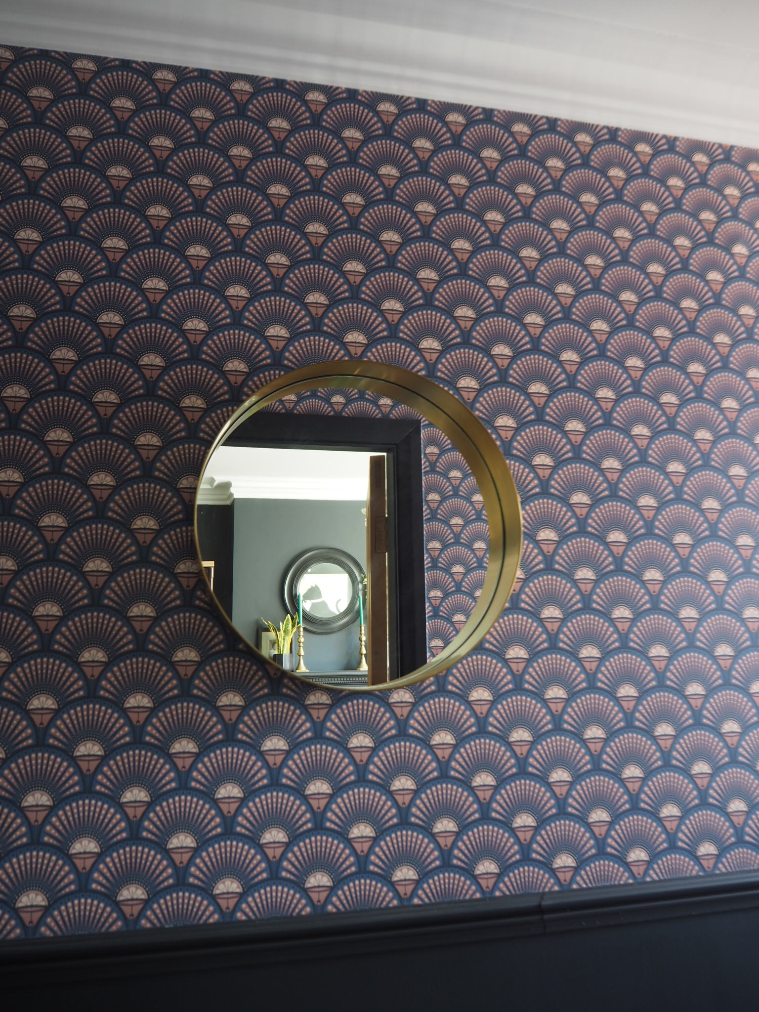
Mirror- Made.com £99, Divine Savages - Deco martini Blush wallpaper £140 per roll

Mirror- Made.com £99, Divine Savages - Deco martini Blush wallpaper £140 per roll

Amanda Cotton selfie

Before we started work, the hallway had previously been painted in light grey emulsion. It was dull, dusty and lacked spark. As we've renovated our victorian house, we've tried to keep a lot of the original features of the house, and where those features had been ripped out, we've tried to  add them back in.  We had a coving specialist replicate the original coving of our lounge throughout our hallway and landing, and my dad kindly put the dado rail up for us to add more character. 

Oh and the corbels you see in the square archway in the entrance hallway, well they were added in to also add some more character. (Purchased from Ebay, and held up by some no nails glue). 

We kept all the original victorian doors, which we had dipped and stripped and re hung. In hindsight, we probably should have replaced them all so they fit better. Upstairs in our loft we went with new painted fire doors with brass handles and these all look amazing, and fit great. If we knew seven years ago that we would go into the loft then we would have done things differently. But hindsight is an amazing thing, eh? 

**Personal Disclaimer** Dark colours can make spaces feel small. Since our hallway's been finished it feels more cosy and characterful. I think you should always decorate a home for you, and not worry about what others think. Stop worrying about whether you are 'adding value'. The added value is knowing that your living in the home of your dreams. 

The floor below is the first floor, which leads to Otis' nursery. We then have a second set of stairs to our converted loft. Two staircases + 3 floors = 11 rolls of wallpaper + a tone of Farrow and ball paint. 

Hallway with deco martini wallpaper and dado rail

As we enter the loft, you'll notice the change of painted doors which I mentioned before. 

The paint as I said is Farrow and ball Railings. We used Modern Emulsion for the walls and Estate Eggshell for the woodwork. We bought most of the paint from Paint depot which always has a 10% discount code for new customers and free delivery... every little helps and all that. You're welcome. FYI, this is the cheapest I've ever been able to find Farrow and Ball paint and I have searched the internet high and low!

I'm not advertising Farrow and ball, but I  think the positive points of farrow and ball are that its factory mixed, which means if you need to top it up, or buy more it should in theory match as its not mixed in one of those machines which have just made up a red, when you want a green. If you catch my drift. Plus I love how it goes on and how the colour is so deep and only requires 2 coats for dark colours, unlike other paints. 

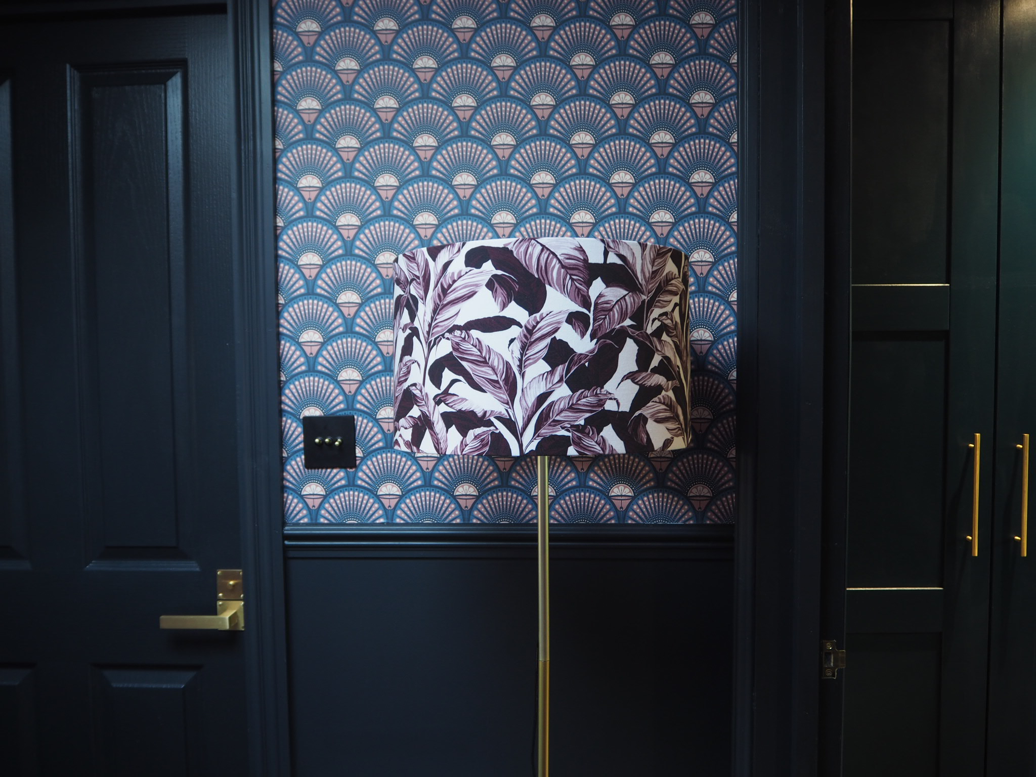
Modlo lampshade £69, floor lamp stand £28- Iconic lights

Modlo lampshade £69, floor lamp stand £28- Iconic lights

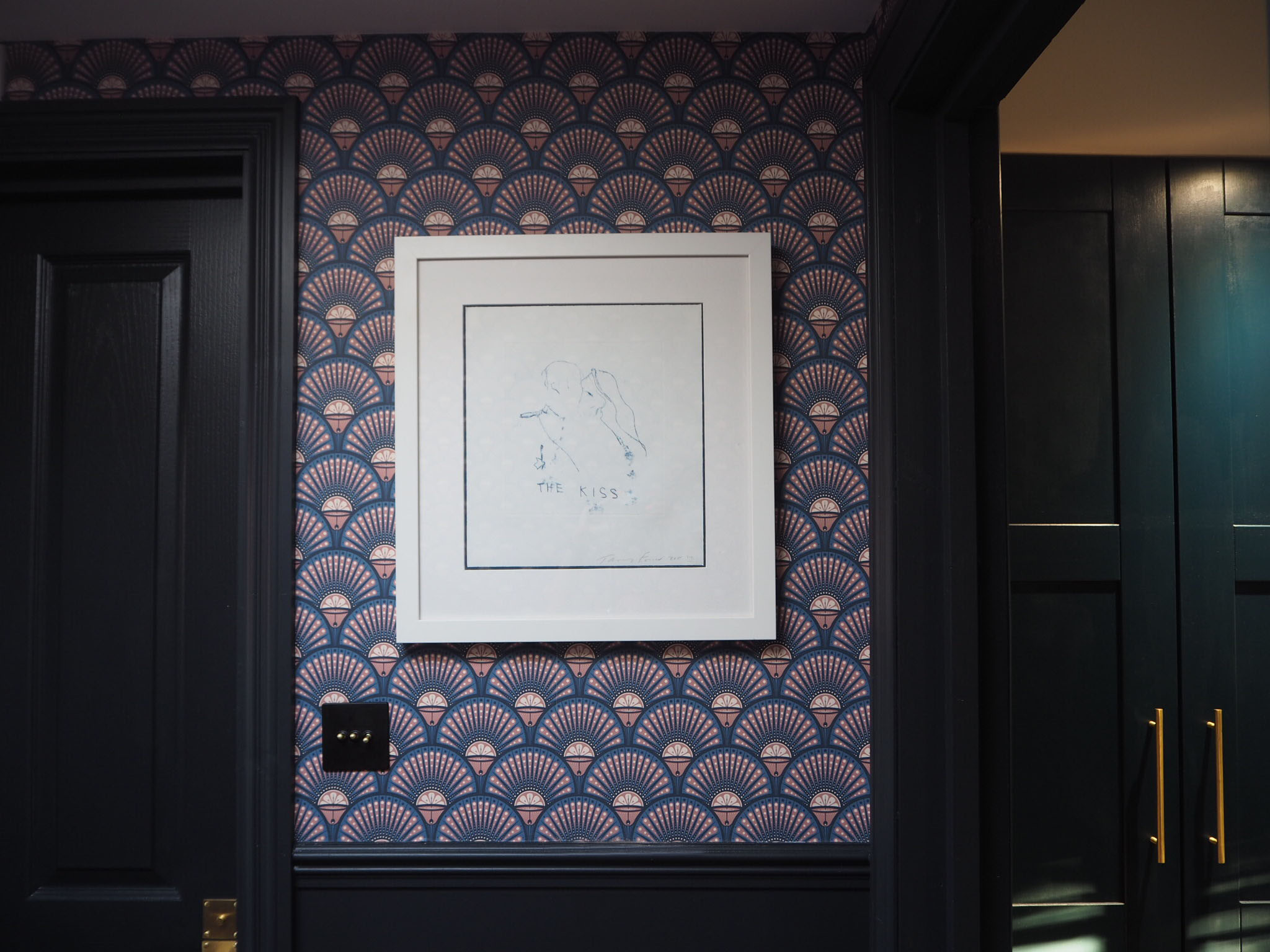
And now onto the wallpaper. oh the wallpaper of dreams.  The Deco martini blush/ blue wallpaper is from the talented guys at Divine Savages. It wasn't free, but it was discounted by them to allow me to do this. Afterall, I needed 11 rolls, and I'm on maternity leave. Thank you lads! I'll forever be in your debt. 

And to quote Darren the decorator "It hangs like a dream". Its heavy, thick and feels expensive, plus I love how it feels in keeping with the era of the house, even though the house is Victorian and the print is more 1920's styling. Plus I love the shades of blush pink mixed back with the blues and dark grey. It fits perfectly with the railings paint.  

Dowsing and Reynolds black & Brass toggle switch £24.99

Dowsing and Reynolds black & Brass toggle switch £24.99

I chose black/brass metal toggle switches from Dowsing and reynolds which worked perfectly against the wallpaper. I then bought cheaper black metal plug sockets from Amazon to blend with the railings paint. 

One conundrum we did face was an unusual angle in the wall, which goes from the loft to the ceiling (below right pic).  Due to the complexity of trying to wallpaper over it, and seeing the wallpaper shooting off in strange directions, Darren the decorator suggested painting it, and wallpapering above and below.  I love how something unexpected ended up being a little added feature.  

We added accents of brass with accessories, such as this pendant glass bulb ceiling light from John Lewis.  I also bought a brass trimmed round mirror from Made.com for the hallway and a brass coat hook rack from West Elm. 

Brass and glass Pendant light from Johnlewis. 

Brass and glass Pendant light from Johnlewis

So I think that's pretty much everything. I love how we've gone from drab to fab in this space. The Divine Savage Deco martini wallpaper adds a wow factor, and I think it's important to add some drama to the entrance of your home since its the first thing people see. And lastly, I love how the print snakes through the centre of the house and links all the levels.  This was an important factor after our loft extension, as we wanted the new spaces to blend with the old and this wallpaper has really helped merge them together and become the heart of the home. 

{HOUSE LUST LOVES} MY CHRISTMAS TABLE WITH SANDRA ISAKSSON

{HOUSE LUST LOVES} MY CHRISTMAS TABLE WITH SANDRA ISAKSSON

Have you planned your Christmas table yet? Don’t fear, it’s still not too late to create something special with just over a week to go.  

Last weekend we had a practice run for the big day when we entertained friends with our new Isak plates by Sandra Isaksson.

Read More